rm(list=ls())Tutorial 9: Scatter Plots and Cleveland Dot Plots
This week we are learning about two types of charts you can create with geom_point(): scatter plots and Cleveland dot plots, also known as lollipop charts.1
Scatter plots are very useful for seeing the relationship between two variables. They are ideal for initial exploratory data analysis. They are usually not the best – without substantial editing – for final data presentation to a non-technical audience.
Cleveland dot plots are a way of summarizing data from a scatter plot. To arrive at data suitable for a Cleveland dot plot, we will revisit some techniques we’ve learned in previous classes: summarize() and pivot_longer(), along with group_by().
A. Clear environment and load packages
I mentioned in an early tutorial, and I mention again here that it sometimes is helpful to get rid of everything in your R environment – all the past dataframes and plots and commands. This is particularly useful when you’ve made a lot of dataframes and your memory is getting clogged, or when you’ve made some odd error and want to start fresh. To clear the R environment, type the below. I usually put it at the beginning of my R programs to be sure that I am working on the most recently loaded dataframe.
Let’s also load packages. This tutorial has no new packages.
library(tidyverse)
library(scales)
B. Load and check out data
For this class we’re using new data: property tax records from Arlington County.
B.1. Load data
I have combined two datasets for you to look at properties in Arlington County. The first dataset comes from here and reports the land and improvements assessed value for each property. These are the values the county assigns to each property for the purposes of taxation.
The second dataset has information on the properties themselves including the use of the structure, the height, the year built and many other things. You can see the variables in this dataset by clicking on “column details.”
To make the dataset we’re using, I kept assessment records from 2025, and merged each property (each row is an individual legally defined piece of property) by the property ID, which is RealEstatePropertyCode. Please download these merged data from here.
Now read these data using `read.csv’.
arl.p <- read.csv("h:/pppa_data_viz/2025/tutorial_data/tutorial_09/arlington_prop_data_merged_20250414.csv")
dim(arl.p)
[1] 66951 80I have 66,951 observations (rows) – hopefully you do, too.
B.2. Explore a little bit
Each observation in this data frame is a property in Arlington County, VA. Broadly speaking, this is the information the county collects on each individual property. Counties in the US (in a few cases, other jurisdictions) are in charge of land ownership records and property taxation.
As these data are new to us, let’s explore these data a bit before moving on.
I use str(), names(), table() and summary() to look at values in this dataframe. I encourage you to use these commands to look at variables other than those I’ve listed below.
The ever.delinquent variable is one I created myself, and it measures whether, in tax year 2024, a property ever had to pay interest, fines or a penalty on property taxes.
names(arl.p) [1] "RealEstatePropertyCode" "ever.delinquent"
[3] "AssessmentKey" "ProvalLrsnId.x"
[5] "AssessmentChangeReasonTypeDsc" "AssessmentDate"
[7] "ImprovementValueAmt" "LandValueAmt"
[9] "TotalValueAmt" "assmt.year"
[11] "PropertyKey" "ProvalLrsnId.y"
[13] "ReasPropertyStatusCode" "PropertyClassTypeCode"
[15] "PropertyClassTypeDsc" "LegalDsc"
[17] "LotSizeQty" "MapBookPageNbr"
[19] "NeighborhoodNbr" "PolygonId"
[21] "PropertyStreetNbrNameText" "PropertyStreetNbr"
[23] "PropertyStreetNbrSuffixCode" "PropertyStreetDirectionPrefixCode"
[25] "PropertyStreetName" "PropertyStreetTypeCode"
[27] "PropertyStreetDirectionSuffixCode" "PropertyUnitNbr"
[29] "PropertyCityName" "PropertyZipCode"
[31] "GisStreetCode" "PhysicalAddressPrimeInd"
[33] "ZoningDescListText" "FirstOwnerName"
[35] "SecondOwnerName" "AdditionalOwnerText"
[37] "TradeName" "OwnerStreetText"
[39] "OwnerCityName" "OwnerStateCode"
[41] "OwnerZipCode" "CompressedOwnerText"
[43] "PropertyYearBuilt" "GrossFloorAreaSquareFeetQty"
[45] "EffectiveAgeYearDate" "NumberOfUnitsCnt"
[47] "StoryHeightCnt" "ValuationYearDate"
[49] "CommercialPropertyTypeDsc" "EconomicUnitNbr"
[51] "CondoModelName" "CondoStyleName"
[53] "FinishedStorageAreaSquareFeetQty" "StorageAreaSquareFeetQty"
[55] "UnitNbr" "ReasPropertyOwnerKey"
[57] "ArlingtonStreetKey" "PropertyExpiredInd"
[59] "MixedUseInd" "CommercialInd"
[61] "DistrictNbr" "TaxExemptionTypeDsc"
[63] "CondominiumProjectName" "MasterRealEstatePropertyCode"
[65] "StreetNbrOrder" "ResourceProtectionAreaInd"
[67] "LandRecordDocumentNbr" "StatePlaneXCrd"
[69] "StatePlaneYCrd" "LatitudeCrd"
[71] "LongitudeCrd" "PhysicalAddressKey"
[73] "PropertyStormWaterInd" "CondoPatioAreaSquareFeetQty"
[75] "CondoDenCnt" "CondoOpenBalconySquareFeetQty"
[77] "CondoEnclosedBalconySquareFeetQty" "CondoParkingSpaceIdListText"
[79] "CondoStorageSpaceIdListText" "MaskOwnerAddressInd" str(arl.p)'data.frame': 66951 obs. of 80 variables:
$ RealEstatePropertyCode : int 1001001 1001007 1001008 1001009 1001010 1001011 1001012 1001013 1001014 1001016 ...
$ ever.delinquent : int 0 0 0 0 0 0 0 0 0 0 ...
$ AssessmentKey : int 43 123 166 209 252 295 338 381 425 505 ...
$ ProvalLrsnId.x : int 132 134 135 136 137 138 139 140 141 143 ...
$ AssessmentChangeReasonTypeDsc : chr "01- Annual" "01- Annual" "01- Annual" "01- Annual" ...
$ AssessmentDate : chr "2025-01-01T00:00:00Z" "2025-01-01T00:00:00Z" "2025-01-01T00:00:00Z" "2025-01-01T00:00:00Z" ...
$ ImprovementValueAmt : int 0 1288500 909000 512400 468600 643500 947700 96100 634900 118400 ...
$ LandValueAmt : int 197700 938900 954100 849000 857700 876700 904300 875700 916000 887200 ...
$ TotalValueAmt : int 197700 2227400 1863100 1361400 1326300 1520200 1852000 971800 1550900 1005600 ...
$ assmt.year : int 2025 2025 2025 2025 2025 2025 2025 2025 2025 2025 ...
$ PropertyKey : int 65652 56253 2 3 56254 4 5 6 7 9 ...
$ ProvalLrsnId.y : int 132 134 135 136 137 138 139 140 141 143 ...
$ ReasPropertyStatusCode : chr "A" "A" "A" "A" ...
$ PropertyClassTypeCode : int 510 511 511 511 511 511 511 511 511 511 ...
$ PropertyClassTypeDsc : chr "510-Res - Vacant(SF & Twnhse)" "511-Single Family Detached" "511-Single Family Detached" "511-Single Family Detached" ...
$ LegalDsc : chr "PT LT 3 RESUB PT LT 3 ROWENA S PHILLIPS SUBD 3,005 SQ FT" "LOT 1 B RESUB 1ST ADDN SEC 4 OAKWOOD 15367 SQ FT" "LT 2 A RESUB PARC B 1ST ADDN SEC 4 OAKWOOD 19094 SQ FT" "LT 53 SEC 2 MINOR HILL 10065 SQ FT" ...
$ LotSizeQty : int 3005 15367 19094 10065 10805 10187 12483 10103 13459 11061 ...
$ MapBookPageNbr : chr "030-14" "040-03" "040-03" "040-03" ...
$ NeighborhoodNbr : int 501001 501001 501001 501001 501001 501001 501001 501001 501001 501001 ...
$ PolygonId : chr "01001001" "01001007" "01001008" "01001009" ...
$ PropertyStreetNbrNameText : chr "N ROCHESTER ST" "3007 N ROCHESTER ST" "3001 N ROCHESTER ST" "6547 WILLIAMSBURG BLVD" ...
$ PropertyStreetNbr : int NA 3007 3001 6547 6541 3510 3518 3526 3530 3538 ...
$ PropertyStreetNbrSuffixCode : chr "" "" "" "" ...
$ PropertyStreetDirectionPrefixCode: chr "N" "N" "N" "" ...
$ PropertyStreetName : chr "ROCHESTER" "ROCHESTER" "ROCHESTER" "WILLIAMSBURG" ...
$ PropertyStreetTypeCode : chr "ST" "ST" "ST" "BLVD" ...
$ PropertyStreetDirectionSuffixCode: chr "" "" "" "" ...
$ PropertyUnitNbr : chr "" "" "" "" ...
$ PropertyCityName : chr "ARLINGTON" "ARLINGTON" "ARLINGTON" "ARLINGTON" ...
$ PropertyZipCode : int 22213 22213 22213 22213 22213 22213 22213 22213 22213 22213 ...
$ GisStreetCode : chr "NROCST" "NROCST" "NROCST" "_WILBLVD" ...
$ PhysicalAddressPrimeInd : logi TRUE TRUE TRUE TRUE TRUE TRUE ...
$ ZoningDescListText : chr "R-10" "R-10" "R-10" "R-10" ...
$ FirstOwnerName : chr "Redacted" "Redacted" "Redacted" "Redacted" ...
$ SecondOwnerName : chr "Redacted" "Redacted" "Redacted" "Redacted" ...
$ AdditionalOwnerText : chr "Redacted" "Redacted" "Redacted" "Redacted" ...
$ TradeName : chr "" "" "" "" ...
$ OwnerStreetText : chr "2216 N TORONTO ST" "3007 N ROCHESTER ST" "3001 N ROCHESTER ST" "6547 WILLIAMSBURG BLVD" ...
$ OwnerCityName : chr "FALLS CHURCH" "ARLINGTON" "ARLINGTON" "ARLINGTON" ...
$ OwnerStateCode : chr "VA" "VA" "VA" "VA" ...
$ OwnerZipCode : chr "22043" "22213" "22213" "22213" ...
$ CompressedOwnerText : chr "Redacted" "Redacted" "Redacted" "Redacted" ...
$ PropertyYearBuilt : int NA 2012 2010 1950 1950 1950 2008 1950 1950 1950 ...
$ GrossFloorAreaSquareFeetQty : int NA NA NA NA NA NA NA NA NA NA ...
$ EffectiveAgeYearDate : int NA NA NA NA NA NA NA NA NA NA ...
$ NumberOfUnitsCnt : int NA NA NA NA NA NA NA NA NA NA ...
$ StoryHeightCnt : int NA NA NA NA NA NA NA NA NA NA ...
$ ValuationYearDate : int NA NA NA NA NA NA NA NA NA NA ...
$ CommercialPropertyTypeDsc : chr "" "" "" "" ...
$ EconomicUnitNbr : chr "" "" "" "" ...
$ CondoModelName : chr "" "" "" "" ...
$ CondoStyleName : chr "" "" "" "" ...
$ FinishedStorageAreaSquareFeetQty : int NA NA NA NA NA NA NA NA NA NA ...
$ StorageAreaSquareFeetQty : int NA NA NA NA NA NA NA NA NA NA ...
$ UnitNbr : chr "" "" "" "" ...
$ ReasPropertyOwnerKey : int 21116 20832 52443 56161 56162 49444 26923 36720 41521 11454 ...
$ ArlingtonStreetKey : int 179 179 179 222 222 185 185 185 185 185 ...
$ PropertyExpiredInd : logi FALSE FALSE FALSE FALSE FALSE FALSE ...
$ MixedUseInd : logi FALSE FALSE FALSE FALSE FALSE FALSE ...
$ CommercialInd : logi FALSE FALSE FALSE FALSE FALSE FALSE ...
$ DistrictNbr : chr "0G" "0G" "0G" "0G" ...
$ TaxExemptionTypeDsc : chr "" "" "" "" ...
$ CondominiumProjectName : chr "" "" "" "" ...
$ MasterRealEstatePropertyCode : chr "01001001" "01001007" "01001008" "01001009" ...
$ StreetNbrOrder : int 1 0 0 0 0 0 0 0 0 0 ...
$ ResourceProtectionAreaInd : logi FALSE FALSE FALSE FALSE FALSE FALSE ...
$ LandRecordDocumentNbr : chr "" "20220100014012" "20180100002103" "" ...
$ StatePlaneXCrd : num 11863394 11864236 11864294 11864424 11864495 ...
$ StatePlaneYCrd : num 7013740 7013529 7013457 7013509 7013564 ...
$ LatitudeCrd : num 38.9 38.9 38.9 38.9 38.9 ...
$ LongitudeCrd : num -77.2 -77.2 -77.2 -77.2 -77.2 ...
$ PhysicalAddressKey : int 69969 69970 69971 69972 69973 69974 69975 69976 69977 69979 ...
$ PropertyStormWaterInd : logi FALSE FALSE FALSE FALSE FALSE FALSE ...
$ CondoPatioAreaSquareFeetQty : int NA NA NA NA NA NA NA NA NA NA ...
$ CondoDenCnt : int NA NA NA NA NA NA NA NA NA NA ...
$ CondoOpenBalconySquareFeetQty : int NA NA NA NA NA NA NA NA NA NA ...
$ CondoEnclosedBalconySquareFeetQty: int NA NA NA NA NA NA NA NA NA NA ...
$ CondoParkingSpaceIdListText : chr "" "" "" "" ...
$ CondoStorageSpaceIdListText : chr "" "" "" "" ...
$ MaskOwnerAddressInd : logi FALSE FALSE FALSE FALSE FALSE FALSE ...table(arl.p$NumberOfUnitsCnt)
  0   1   3   5   6   7   8   9  10  11  12  13  14  15  16  17  18  19  20  21
  9   6   3   2   1   3   4   3   3   7   1   1   1   1   2   1   8   3   1   4
 22  24  25  26  28  30  31  32  33  34  36  37  38  40  41  42  44  45  46  47
  2   1   1   1   1   7   3   2   3   1   2   3   2   3   3   2   1   1   2   1
 48  49  50  51  52  57  62  63  64  66  67  74  75  77  79  80  81  82  83  84
  1   2   1   2   1   1   1   2   1   1   1   2   4   2   1   3   2   2   3   1
 85  87  88  90  91  92  93  94  97  99 100 102 104 105 108 109 110 114 116 119
  1   1   2   2   1   1   3   1   3   1   6   1   2   1   2   1   1   2   2   1
120 121 122 123 126 128 131 132 134 135 138 141 143 146 148 152 154 157 159 161
  1   1   1   1   2   3   1   2   3   1   4   1   3   1   1   3   2   1   1   1
162 163 168 173 175 180 181 183 184 187 188 191 198 199 200 202 204 205 210 212
  2   1   2   1   1   1   4   1   3   1   3   1   1   2   3   1   1   1   1   1
213 214 217 218 219 220 221 225 227 228 231 234 235 237 238 241 244 248 250 252
  1   2   1   2   1   2   1   2   1   1   1   1   2   1   2   1   2   1   3   1
253 254 255 256 257 261 262 265 266 267 269 270 272 273 274 280 295 298 300 302
  1   1   1   1   2   2   2   2   1   1   1   1   1   1   1   2   1   1   2   1
303 305 306 308 314 318 321 325 326 330 331 333 336 337 338 339 342 344 347 348
  1   1   1   1   1   2   1   3   1   2   2   1   1   1   1   1   1   1   1   1
350 360 362 363 366 378 382 383 386 393 400 406 411 412 420 423 435 436 440 452
  1   2   1   1   3   2   1   1   1   1   1   3   1   1   1   2   1   1   1   1
453 454 455 458 472 474 476 491 496 499 504 509 534 538 558 564 571 575 647 686
  1   1   1   1   1   1   1   1   1   1   1   1   1   1   1   1   1   1   1   1
698 699 714 717 732 877
1 1 1 1 2 1 table(arl.p$PropertyYearBuilt)
   0 1000 1742 1750 1832 1836 1840 1845 1848 1850 1860 1862 1865 1866 1867 1868
   5  154    1    1    1    2    1    1    1    3    4    1    1    1    1    1
1870 1871 1875 1876 1880 1881 1887 1888 1890 1891 1892 1894 1895 1896 1898 1899
   2    1    1    1   14    1    1    2    7    1    1    2    2    2    2    1
1900 1901 1902 1904 1905 1906 1907 1908 1909 1910 1911 1912 1913 1914 1915 1916
 115    4    4   90   41    6   11   12   20  126   13   19   29   21   83   13
1917 1918 1919 1920 1921 1922 1923 1924 1925 1926 1927 1928 1929 1930 1931 1932
  16   33   41  457   37   80   93  260  434  104   91  117  181  430   49   99
1933 1934 1935 1936 1937 1938 1939 1940 1941 1942 1943 1944 1945 1946 1947 1948
  78  146  491  343  711 1074 1906 4768 1421  735  203 1759  476  621 1772 1165
1949 1950 1951 1952 1953 1954 1955 1956 1957 1958 1959 1960 1961 1962 1963 1964
 604 2174 1284 1072  710  723 2463  654  356  678  750  629  655  358  262  641
1965 1966 1967 1968 1969 1970 1971 1972 1973 1974 1975 1976 1977 1978 1979 1980
1637  798  206  151  276  100  105  131  453  579  101  415  125  211  728  693
1981 1982 1983 1984 1985 1986 1987 1988 1989 1990 1991 1992 1993 1994 1995 1996
 708  500 1059  547  419 1029  855  243  837  165  271  727  195  351  608  358
1997 1998 1999 2000 2001 2002 2003 2004 2005 2006 2007 2008 2009 2010 2011 2012
 129  325  172  463  270  378  851  362 2039 1529  914  724  431  324  206  241
2013 2014 2015 2016 2017 2018 2019 2020 2021 2022 2023
364 218 320 277 317 319 267 227 425 201 8 summary(arl.p$PropertyYearBuilt) Min. 1st Qu. Median Mean 3rd Qu. Max. NA's
0 1944 1958 1964 1989 2023 4038 summary(arl.p$ever.delinquent) Min. 1st Qu. Median Mean 3rd Qu. Max. NA's
0.0000 0.0000 0.0000 0.0296 0.0000 1.0000 800 From this I learn that there are many variables in this dataframe, that most structures don’t have a measure of the number of units (from NumberOfUnitsCnt), and a few structures have many units. The median structure in Arlington was built in 1958 (PropertyYearBuilt), and that most properties were not delinquent on taxes in 2024.
C. Basic scatters and drawing attention
We now turn to some basic scatter plots to show the relationship between two variables. We’ll rely on geom_point(), which is similar to the ggplot commands we’ve used so far. We then move to two methods for calling out particular areas or conditions of interest.
C.1. Basic scatters
We begin by looking at the correlation between the assessed value of land and the assessed value of the improvements on that land (the structure(s)). The assessed value is the value that the county assessor gives to the property for purposes of taxation. It is distinct from the market value, which is the value for which a property sells on the open market.
Generally, economists anticipate that higher value land should have higher valued structures. We can see whether the data are consistent with this hypothesis using a scatter plot.
We start by simply plotting these two measures, specifying the dataframe and the x (land value) and y (improvement value) amounts.
c0 <-
  ggplot() +
  geom_point(data = arl.p,
             mapping = aes(x = LandValueAmt, y = ImprovementValueAmt)) +
  labs(title = "first pass: land value vs improvement value")
c0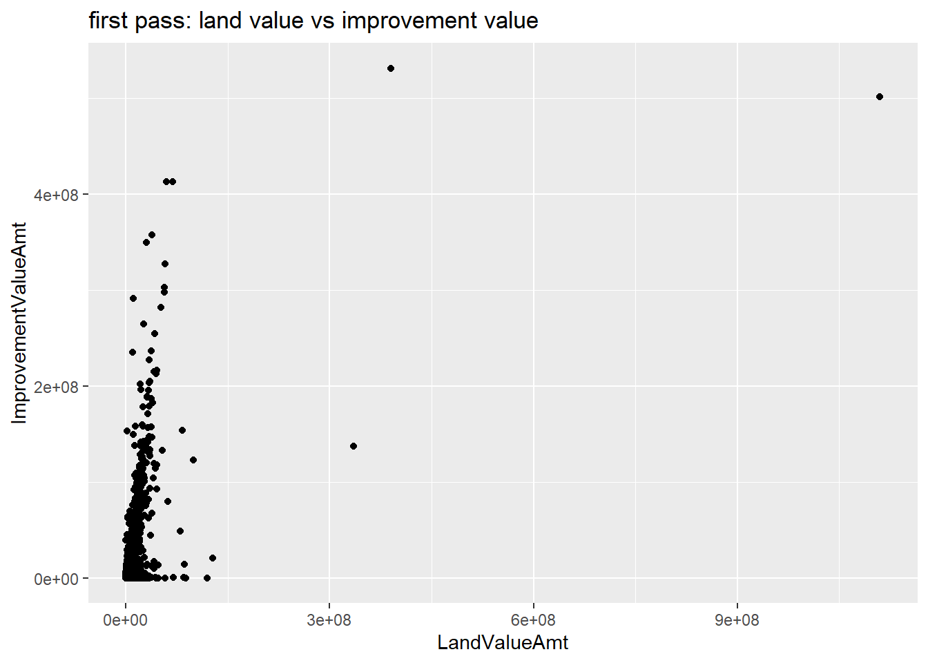
This plot is illegible! The large values at the high end of the distribution make the part of the distribution where the majority of observations lie invisible. In addition, the numbers on the plot are in scientific notation, which is hard to read. We can fix the problem of outliers in two ways.
We’ll begin by just omitting the outliers. This isn’t good statistical practice if the outliers are true data, but if we are predominantly concerned about the relationship for most observations (and we’re clear about what we’re doing) this is ok.
You can modify the sample multiple different ways. You can create a new dataframe that is limited by some conditions, and just call that dataframe. You can subset the dataframe directly in the ggplot command, or you can use limits = c(min(xxx), max(xxx)) inside of the scale_x_continuous() command. Here I subset the dataframe inside the ggplot command.
I also return to the commas option we’ve used before in scale_[x or y]_continuous to put commas in the axis numbers. This makes them very easy to interpret.
# (1) omit outliers, add commas
c0 <-
  ggplot() +
  geom_point(data = filter(arl.p, TotalValueAmt < 5000000),
             mapping = aes(x = LandValueAmt, y = ImprovementValueAmt)) +
  scale_x_continuous(label=comma) +
  scale_y_continuous(label=comma) +
  labs(title = "land value vs improvment value: omitting outliers")
c0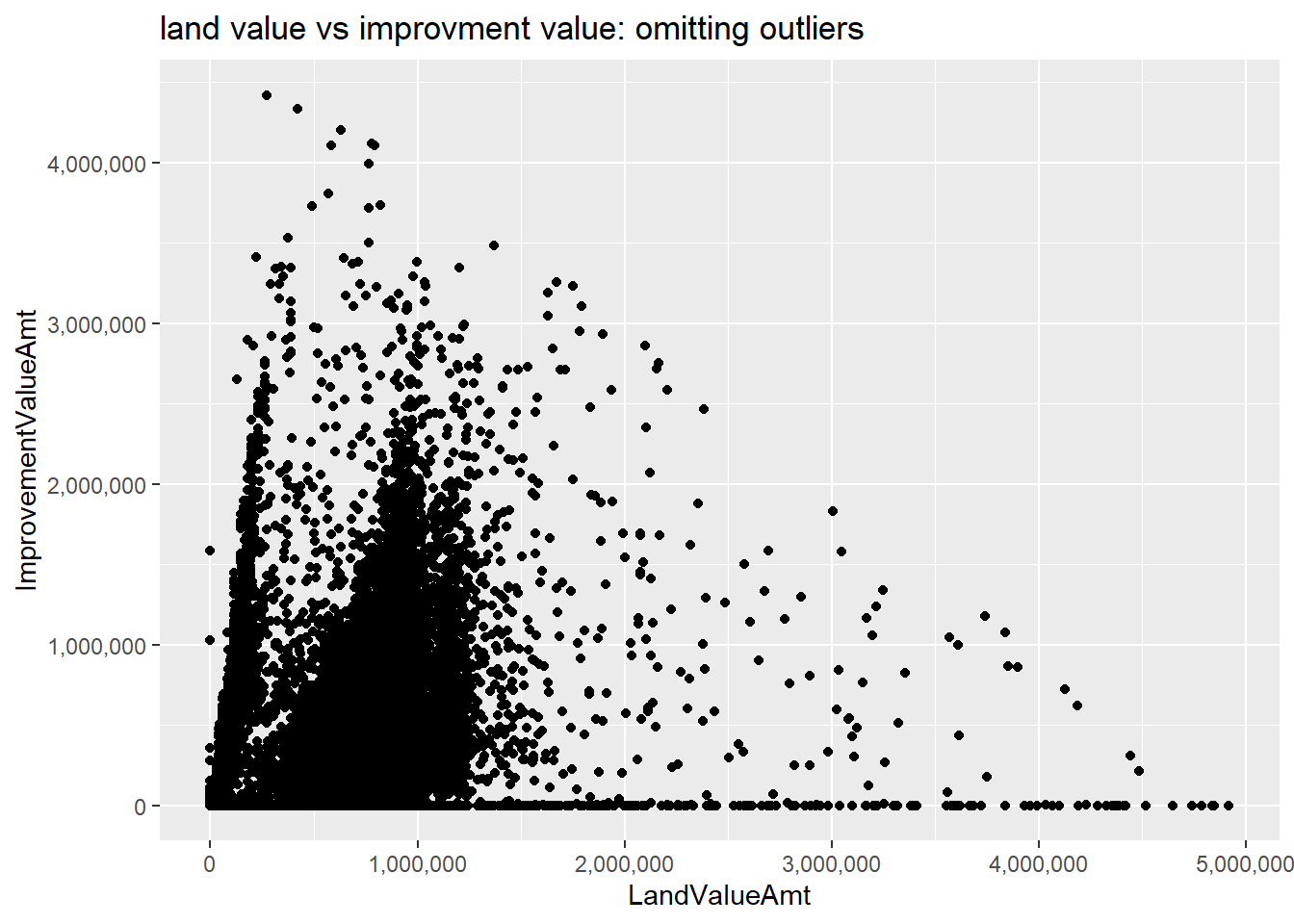
Another way to “squish” a distribution is by taking logs. The log function spreads out the small numbers and relatively shrinks the big numbers. (If this makes no sense, google “graph of log function” and take a look at how the log function transforms data.)
We want to take the log of two variables. You could write a log command twice, but you can also be a more efficient programmer in case you decide to come back and make more logged variables. To program efficiently, don’t use a loop – and in fact, I’m reasonably confident you cannot use a loop for this problem because of difficulties getting R to recognize a variable name made from a loop variable.
Thankfully, there is a quick, elegant solution (that took me over an hour to figure out when I first did this). Create two new columns based on the log of two existing columns, using paste0 to create the new names.
# (2) take logs
tolog <- c("LandValueAmt","ImprovementValueAmt")
arl.p[paste0("ln.",tolog)] <- log(arl.p[tolog])
What this is actually doing is saying
arl.p["ln.LandValueAmt","ln.ImprovementValueAmt"] <-
  log(arl.p["LandValueAmt","ImprovementValueAmt"])
For large dataframes, this type of processing is also faster than loops.
Now create the logged version of the graph using these new variables (alternatively, you could have logged them in the ggplot command).
cln <-
  ggplot() +
  geom_point(data = arl.p,
             mapping = aes(x = ln.LandValueAmt, y = ln.ImprovementValueAmt)) +
  labs(title = "with logs")
cln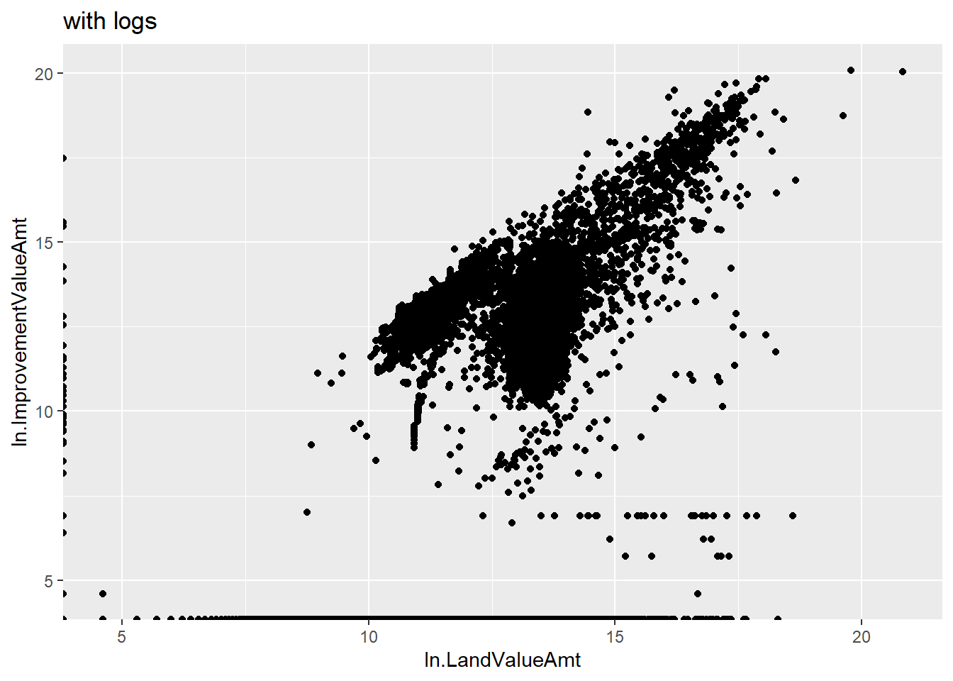
This is clearly better than the first one in the sense of seeing all the data. Of course, logged values are also more difficult to understand!
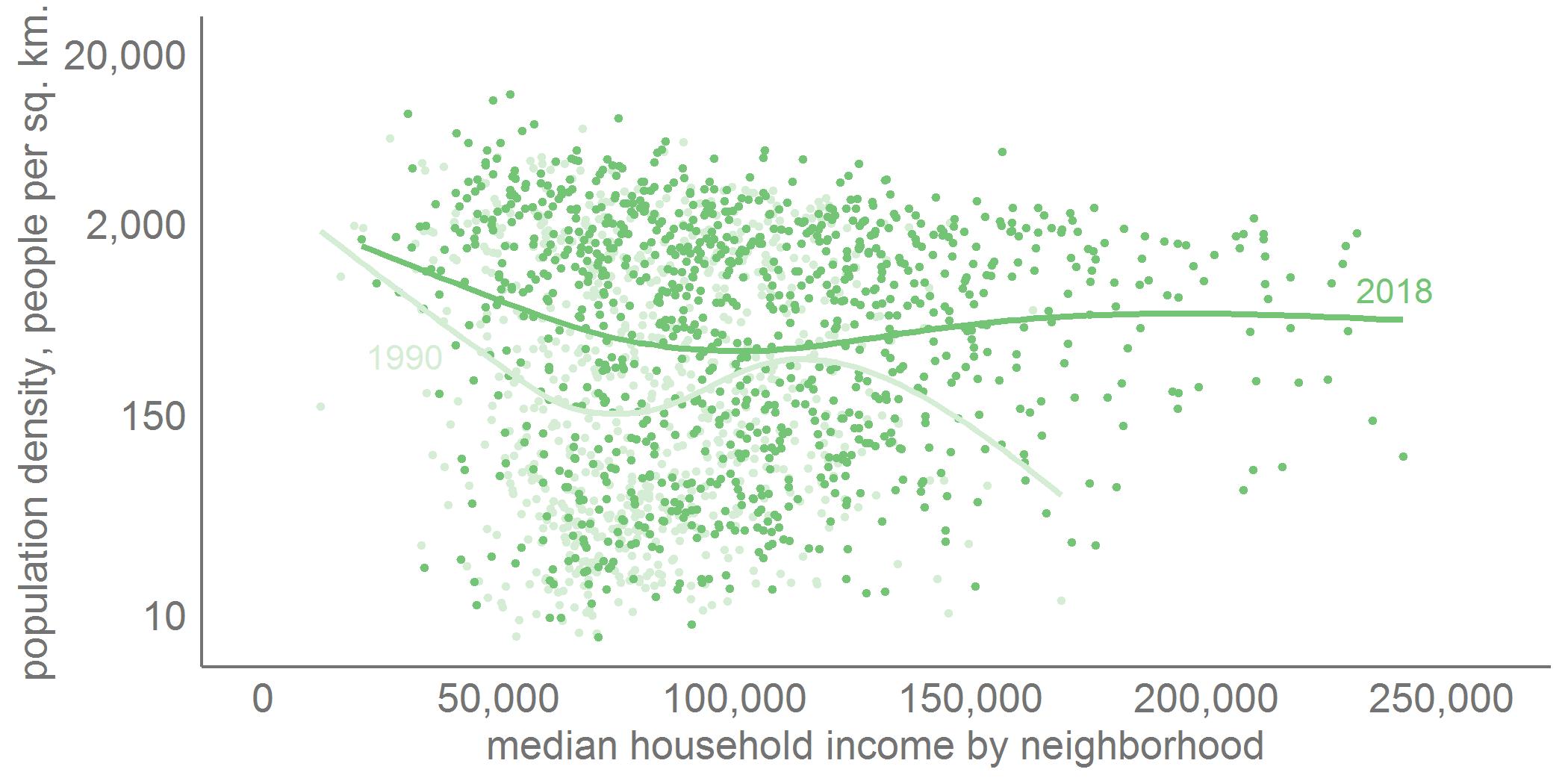
One way to deal with this issue of logged variables is to label the axis of the logged variables with the levels, rather than the logged values. As an example, my graph below, using different data, does this. It shows the relationship between neighborhood population density and neighborhood median income for the exurban jurisdictions of the greater Washington area. The y axis values are logged, but I report the level values, rather than the logged ones. Note that the spacing isn’t exactly equal between the axis numbers (by construction).
C.2. Call out particular areas
If you’re using a scatterplot for presentation purposes, you’re frequently interested in calling out an area or group. In this section we’ll call out properties with delinquent taxes to see if they systematically differ from properties at large. I’ll continue using the logged values here, since I found that graph easier to intepret.
We begin by making a marker for tax delinquency, using the TaxBalanceAmt variable. Using summary(), I see that NAs are non-delinquent, so I make those 0, and set all others to 1. I check my results with table().
# lets call out those delinquent on their taxes
table(arl.p$ever.delinquent)
    0     1
64191  1960
Now I repeat the previous chart, but with a second layer of red points for the late tax observations. It’s important to put this call second, as R stacks points, beginning with the first layer. If this tax delinquent layer were first, it would be invisible since it would be covered by the following layer. I use color = "red" outside the aes() command to show the delinquent points.
latetax <-
  ggplot() +
  geom_point(data = arl.p, aes(x = ln.LandValueAmt, y = ln.ImprovementValueAmt)) +
  geom_point(data = arl.p[which(arl.p$TotalAssessedAmt < 5000000),],
             mapping = aes(x = ln.LandValueAmt, y = ln.ImprovementValueAmt)) +
  geom_point(data = arl.p[which(arl.p$TotalValueAmt < 5000000 & arl.p$ever.delinquent == 1),],
             mapping = aes(x = ln.LandValueAmt, y = ln.ImprovementValueAmt),
             color = "red") +
  labs(title = "logged land value vs logged improvment value: no tax payment")
latetax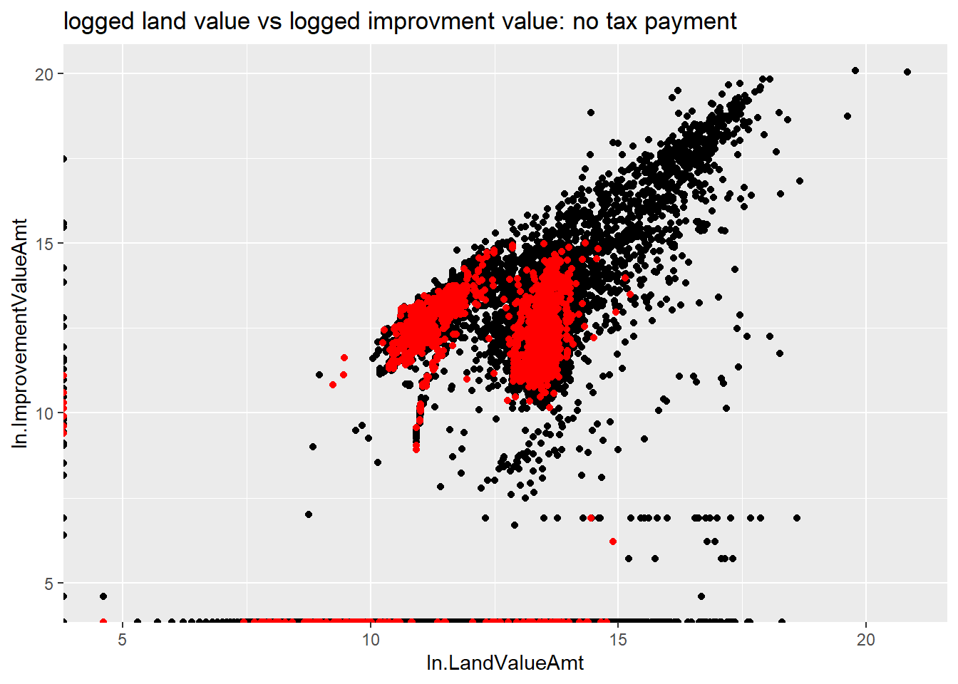
This figure shows that delinquent assessments are much more likely for lower-valued properties. Smaller dots might make this relationship more clear visually.
C.3. Small multiples
Another way to call attention to comparisons in a distribution is to use small multiples. Below I use facet_grid() to compare the relationship between land and improvement value for residential and non-residential property (we did something like this in Tutorial 4). Below I make a graph with two rows; you can also make columns, or a grid with multiple rows and columns.
I don’t think this is the best use of small multiples, but this gives you at least a flavor of what they do.
I use the CommercialInd variable, which takes on the values of TRUE and FALSE for this step.
# residential vs commercial
table(arl.p$CommercialInd)
FALSE  TRUE
64015  2936
h1 <-
ggplot(data = arl.p,
mapping = aes(x = ln.LandValueAmt, y = ln.ImprovementValueAmt)) +
geom_point() +
facet_grid(rows = vars(CommercialInd)) +
labs(title = "logged land vs logged improvement value: by residential/commercial")
h1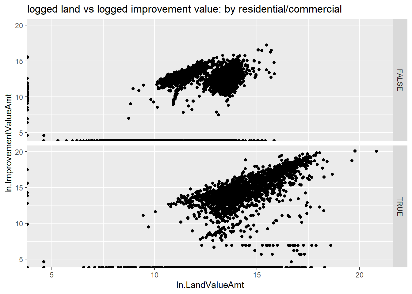
I ask you to think about what these graphs tell us in the homework.
D. A limited scatter: year built and value
We now edge toward looking at a Cleveland dot plot by considering the relationship between the year a structure was built (PropertyYearBuilt) and its value (TotalAssessedAmt).
This is a ggplot geom_point() as before, but recall that the year takes on discrete (as in an integer), rather than continuous, values.
# distribution of assessed value by year built
c1 <-
  ggplot() +
  geom_point(data = arl.p,
             mapping = aes(x = TotalValueAmt, y = PropertyYearBuilt))
c1
Warning: Removed 4038 rows containing missing values or values outside the scale range
(`geom_point()`).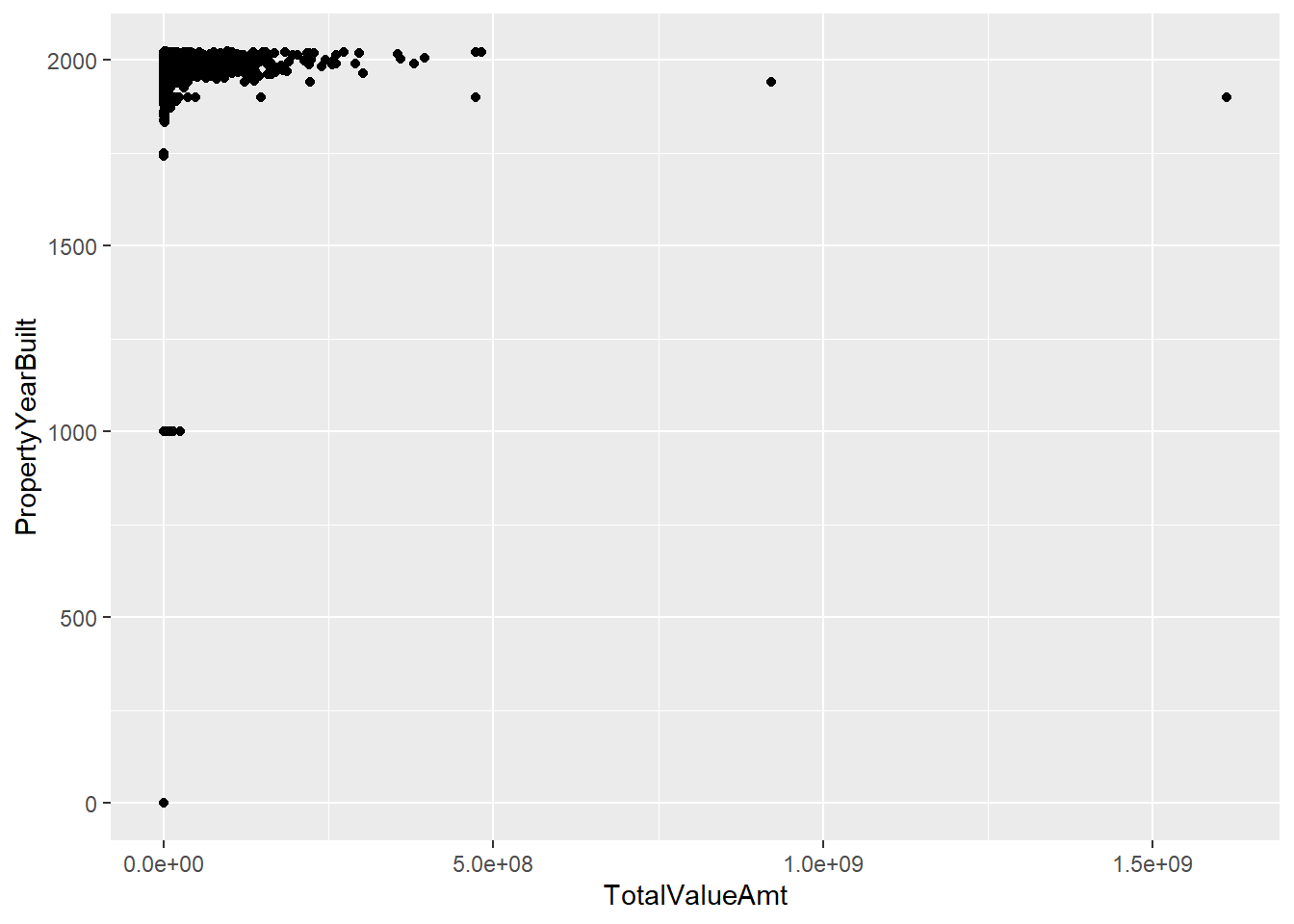
This chart immediately points out some data problems. There are no structures in Arlington from the year 1000. Let’s limit to years 1850 and onward for a better looking chart.
# distribution without some crazy years
c2 <-
  ggplot() +
  geom_point(data = arl.p[which(arl.p$PropertyYearBuilt >1850),],
             mapping = aes(x = TotalValueAmt, y = PropertyYearBuilt))
c2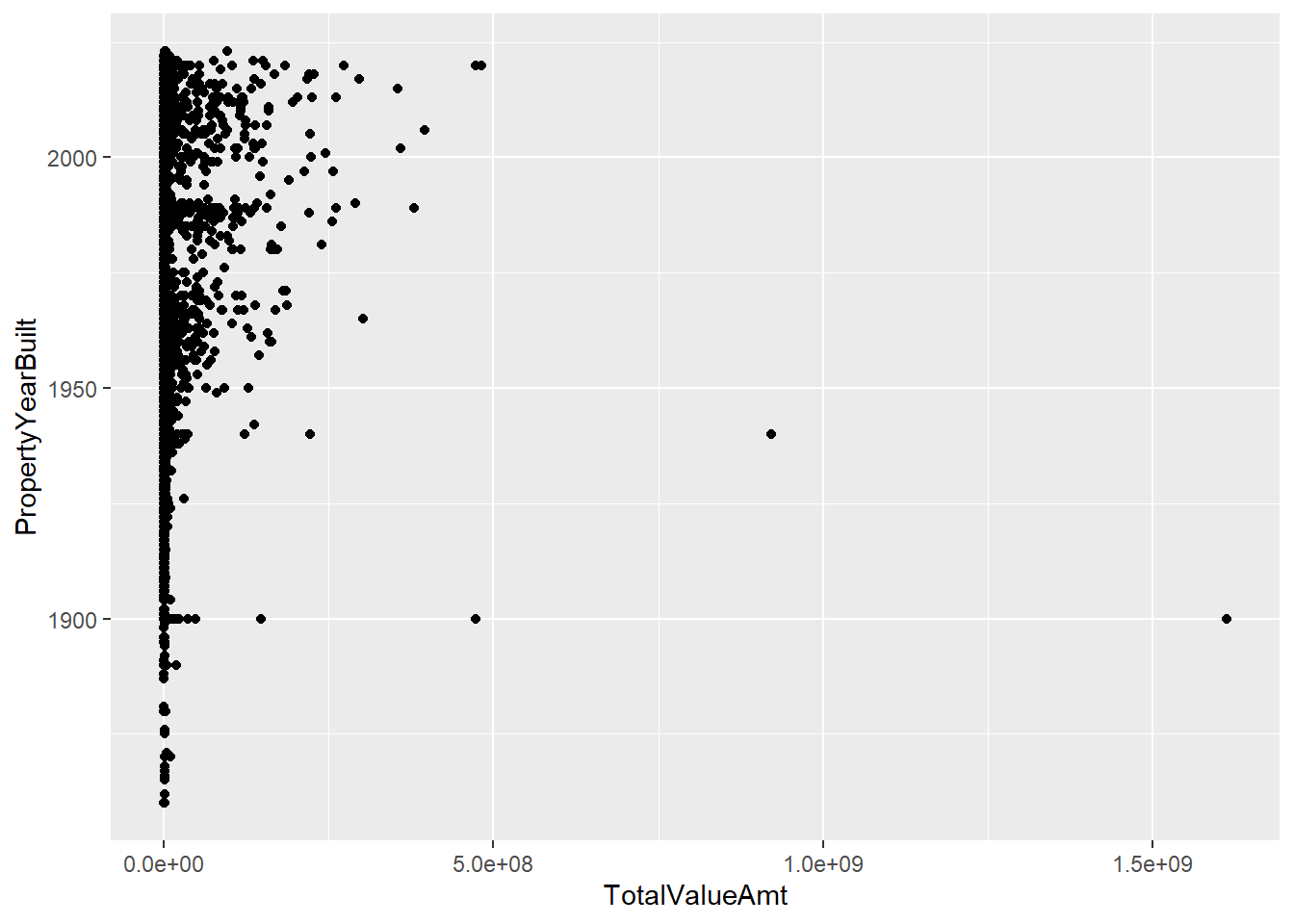
This fix highlights the need to limit the amount of assessed values we consider; for purposes of graphing I set this maximum at 2,000,000, using the limits() option in scale_x_continuous().
# distribution without some crazy assessed values
c4 <-
  ggplot() +
  geom_point(data = arl.p[which(arl.p$PropertyYearBuilt >1900),],
             mapping = aes(x = TotalValueAmt, y = PropertyYearBuilt)) +
  scale_x_continuous(label=comma, limits=c(min(0),
                                           max(2000000)))
c4
Warning: Removed 3071 rows containing missing values or values outside the scale range
(`geom_point()`).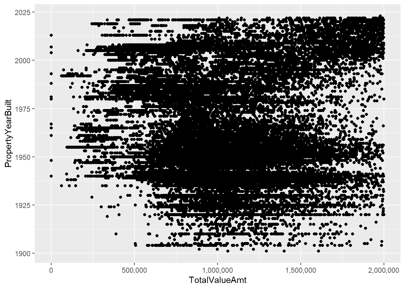
Regardless of these fixes, these charts suffer from having so many dots that it’s hard to understand what’s going on. This is where you need to mix statistics and graphics. We’ll calculate the median assessed value in each year and then limit the plot to this information.
We begin with the combination of group_by() and summarize() that we’ve used before to get a dataframe that has one observation by PropertyYearBuilt.
# find the points
arl.p.byy <- group_by(.data = arl.p, PropertyYearBuilt)
byyear <- summarize(.data = arl.p.byy,
                    med.assed.val = median(TotalValueAmt),
                    med.imp.val = median(ImprovementValueAmt),
                    med.land.val = median(LandValueAmt))
head(byyear)
# A tibble: 6 × 4
PropertyYearBuilt med.assed.val med.imp.val med.land.val
<int> <dbl> <dbl> <dbl>
1 0 753000 649200 103800
2 1000 461650 255100 344300
3 1742 642800 30800 612000
4 1750 929000 186700 742300
5 1832 1296200 404500 891700
6 1836 1310000 206600 1103400With these data in hand, we turn to the plot:
# plot them
e1 <-
  ggplot() +
  geom_point(data = byyear[which(byyear$PropertyYearBuilt >= 1900),],
             mapping = aes(x = med.assed.val,
                           y = PropertyYearBuilt)) +
  labs(title = "first pass, one value by year")
e1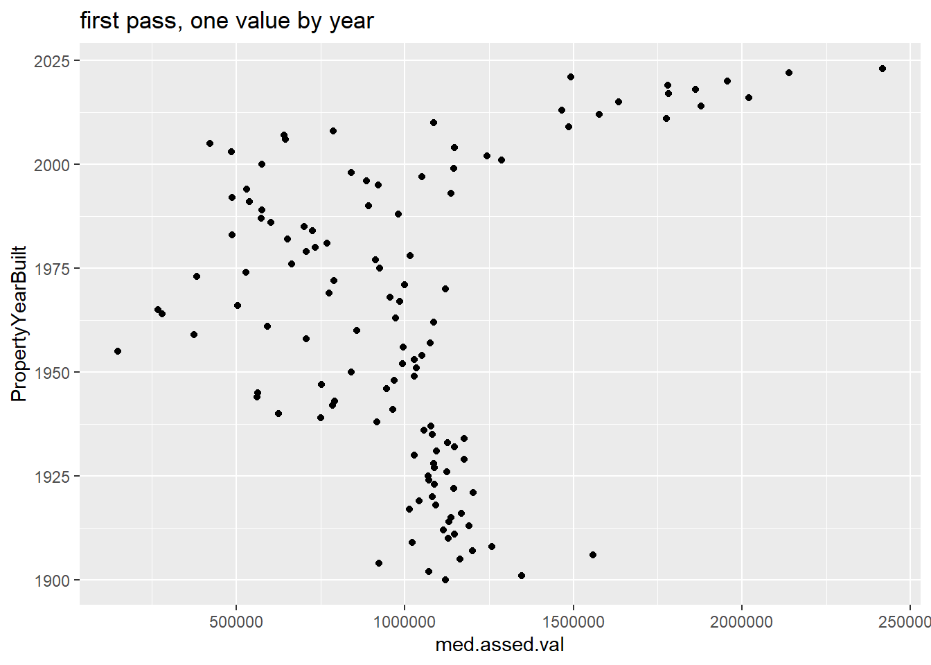
This is easier to understand, but doesn’t do a good job highlighting the horizontal distance, which is the key value in this chart. In fact, the default horizontal distance doesn’t even start at 0, which makes the comparison across years misleading.
A lollipop graph – a version of the Cleveland dot plot – does a better job. In general, I would recommend this for fewer observations that we have here, though this might look fine in a large format. We also use geom_segment(), which takes xend and yend in addition to x and y. This draws a segment from (x,xend) to (y,yend). In our case, we want a straight line, so y and yend are the same. The segment starts at x=0 and ends at the median assessed value for that year.
# lollipop version
e1 <-
  ggplot() +
  geom_point(data = byyear[which(byyear$PropertyYearBuilt >= 1900),],
             mapping = aes(x = med.assed.val,
                           y = PropertyYearBuilt)) +
  geom_segment(data = byyear[which(byyear$PropertyYearBuilt >= 1900),],
               mapping = aes(x = 0, xend = med.assed.val,
                             y = PropertyYearBuilt, yend = PropertyYearBuilt))
  labs(title = "first pass, one value by year")
$title
[1] "first pass, one value by year"
attr(,"class")
[1] "labels"e1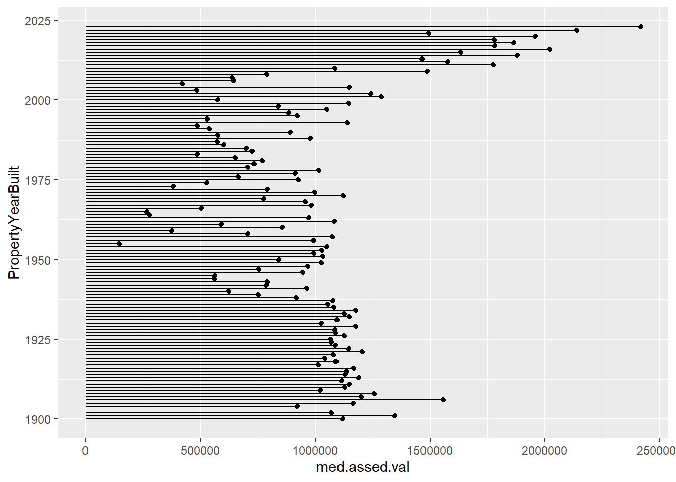
E. More Cleveland dot plots
Now we move to a more serious consideration of the power of dot plots, with many thanks to this excellent tutorial.
E.1. Just one point
We need a smaller set of categories to make a reasonable looking chart, so we will look at the PropertyClassTypeDsc variable (words for the PropertyClassTypeCode variable) and limit our analysis to codes with more than 200 properties. These codes describe the type of property – single family, townhome, commercial, etc.
We start by finding the median assessed value by property class using group_by() and summarize().
# find the points
arl.p.bypc <- group_by(.data = arl.p, PropertyClassTypeDsc)
bypc <- summarize(.data = arl.p.bypc,
                  med.assed.val = median(TotalValueAmt),
                  med.imp.val = median(ImprovementValueAmt),
                  med.land.val = median(LandValueAmt),
                  obs = n())
If you look at the bypc dataframe, you’ll see that there are many property types with few observations (small obs). For legibility – and to concentrate on the bulk of the distribution, we graph types with more than 200 properties. We use geom_point() as a starting point.
# plot them if there are > 200 obs
e1 <-
  ggplot() +
  geom_point(data = bypc[which(bypc$obs > 200),],
             mapping = aes(x = med.assed.val,
                           y = PropertyClassTypeDsc)) +
  labs(title = "first pass, one value by type")
e1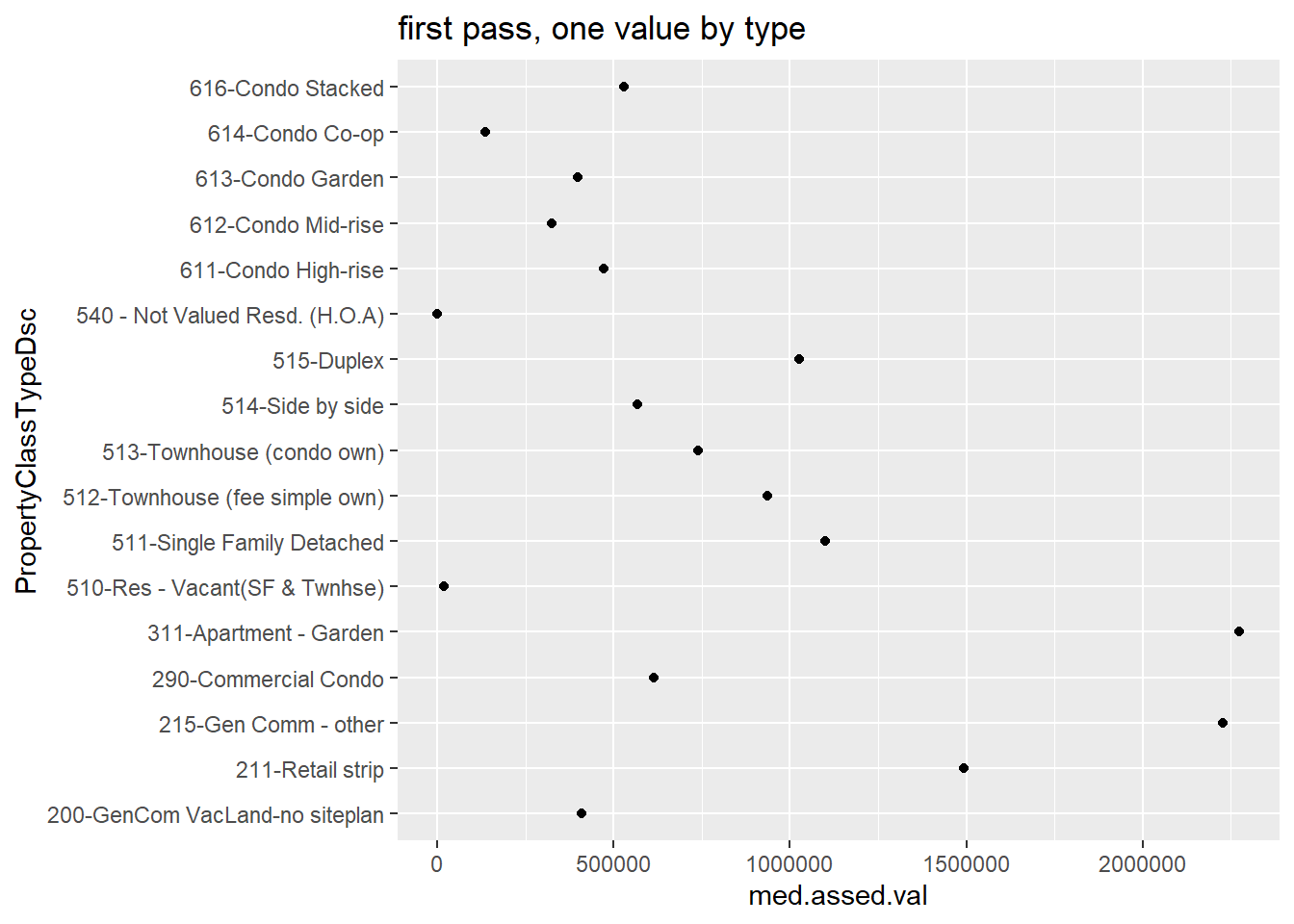
This is not very helpful because the points are not in order. We can order points many ways; here I use reorder() when I call the y variable. The syntax for this command is reorder(graph variable, ordering variable).
# lets get them in order!
e1 <-
  ggplot() +
  geom_point(data = bypc[which(bypc$obs > 200),],
             mapping = aes(x = med.assed.val,
                           y = reorder(PropertyClassTypeDsc, med.assed.val))) +
  labs(title = "first pass, ordered")
e1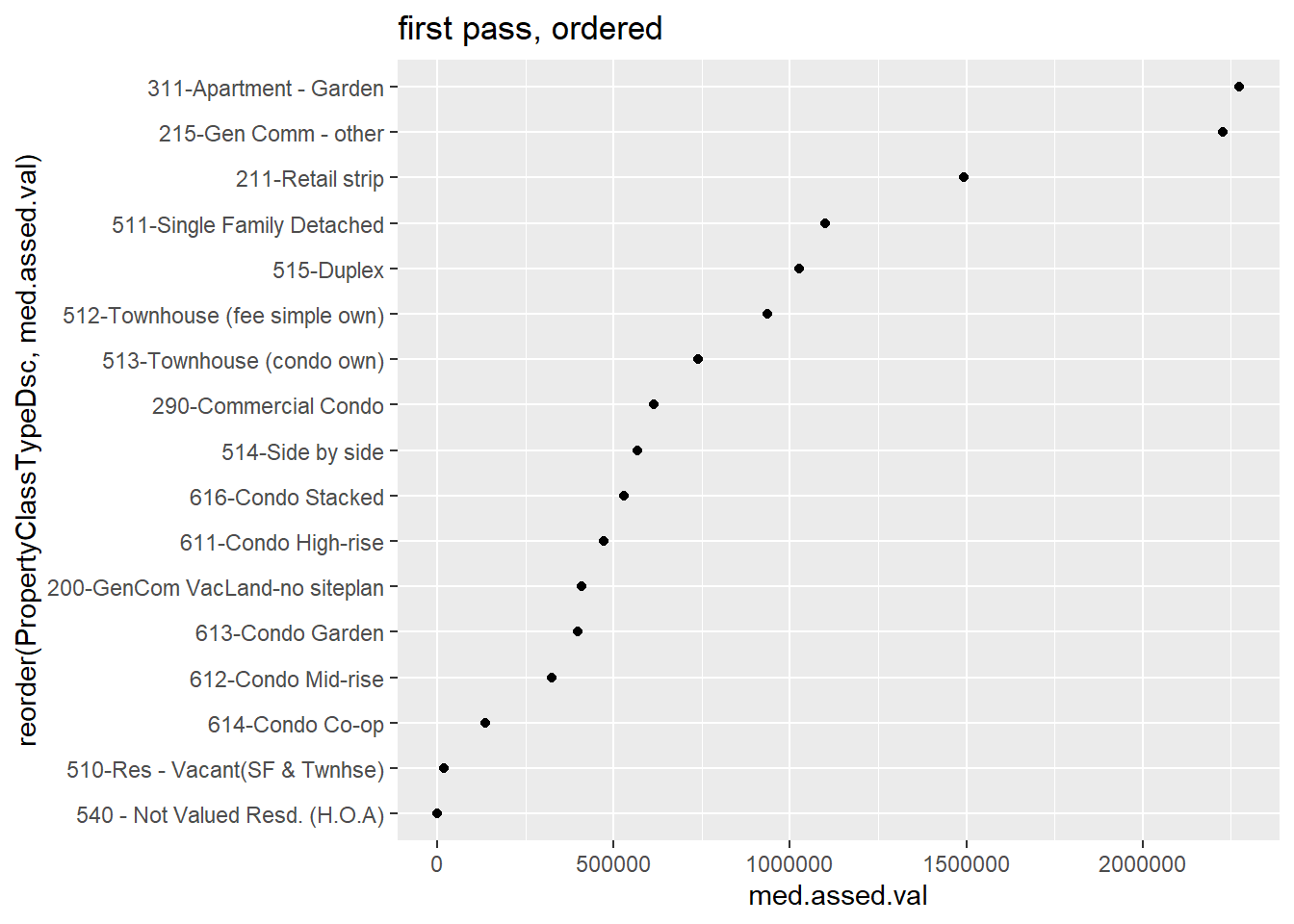
E.2. Two points
The real power of this dot plot is in making comparisons between two measures, as in the Wall Street Journal graphic we discussed in class. However, we’ve just calculated one statistic for each property type; to revise the chart, we’ll need to calculate more than one. Below I use the quantile() command to find the 25th and 75th percentiles of the assessed value distribution by year. This command has at least two required parts: the variable from which to find the distribution, and the point in the distribution for which you’re looking.
# let find the 25th and 75th percentiles
# two points
arl.p.bypc <- group_by(.data = arl.p, PropertyClassTypeDsc)
bypc <- summarize(.data = arl.p.bypc,
                  p50.assed.val = median(TotalValueAmt, na.rm = TRUE),
                  p25.assed.val = quantile(TotalValueAmt, 0.25, na.rm = TRUE),
                  p75.assed.val = quantile(TotalValueAmt, 0.75, na.rm = TRUE),
                  obs = n())
To use the best of R’s tricks for graphing, we need to make these data long. As we have in previous tutorials, we’ll use pivot_longer() to do this. Look in the previous tutorials for a more in-depth explanation of this command, or see the cheat sheet here.
# keep in mind that -obs- now refers to the # of the entire category
bypc.long <- pivot_longer(data = bypc,
                          cols = c("p50.assed.val","p25.assed.val","p75.assed.val"),
                          names_to = "stat.name",
                          values_to = "stat.value")
# pull out the statistic
bypc.long$pnum <- substring(bypc.long$stat.name,2,3)
head(bypc.long)
# A tibble: 6 × 5
PropertyClassTypeDsc obs stat.name stat.value pnum
<chr> <int> <chr> <dbl> <chr>
1 100-Off Bldg-VacLand-no s.plan 9 p50.assed.val 100 50
2 100-Off Bldg-VacLand-no s.plan 9 p25.assed.val 100 25
3 100-Off Bldg-VacLand-no s.plan 9 p75.assed.val 113500 75
4 101-Off Bldg-VacLand-site plan 55 p50.assed.val 1325500 50
5 101-Off Bldg-VacLand-site plan 55 p25.assed.val 299350 25
6 101-Off Bldg-VacLand-site plan 55 p75.assed.val 5156550 75 One way we’ve used to make comparisons across a pair at multiple levels or categories is a paired or grouped bar. Let’s start with that for comparison. Recall that we use geom_col for a bar graph where we’ve already calculated the required statistics. We use position = "dodge" to make paired bars. The aes() option fill = is for our statistic type. We limit the sample to property types with more than 200 properties and to the 75th and 25th percentiles (no median, so bypc.long$pnum != "50").
# use the comparison to bar charts
badbar <-
  ggplot() +
  geom_col(data = bypc.long[which(bypc.long$pnum != "50" & bypc.long$obs > 200),],
           mapping = aes(x = reorder(PropertyClassTypeDsc, stat.value),
                         y = stat.value, fill = stat.name),
           position = "dodge") +
  coord_flip()
badbar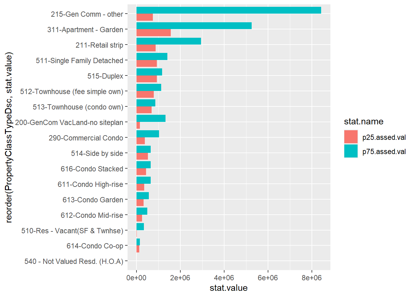
This picture is not a disaster – but it’s cluttered and doesn’t always make the best visual comparison between the relevant two bar lengths. Instead, let’s use a dot plot. We’ll start by just plotting both the 25th and 75th percentiles (and omitting the category “215”, which is commercial buildings, which has a high 75th percentile and makes the graph look odd).
# two colors
twoc <-
  ggplot() +
  geom_point(data = bypc.long[which(bypc.long$pnum != "50"
                                  & bypc.long$obs > 200
                                  & bypc.long$PropertyClassTypeDsc != "215-Gen Comm - other"),],
           aes(x = stat.value, y = reorder(PropertyClassTypeDsc, stat.value), color = stat.name))
twoc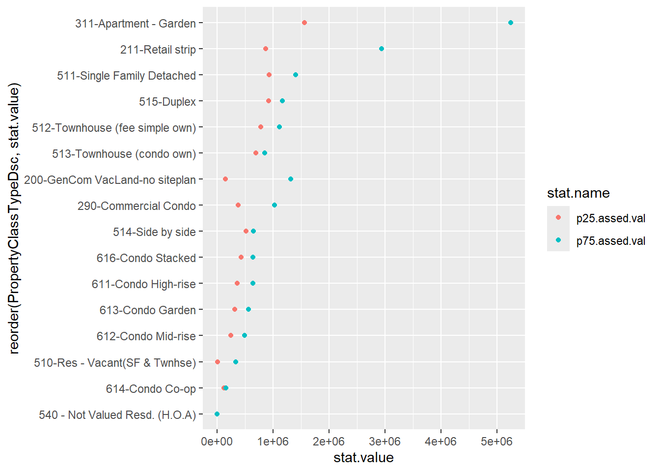
Now let’s do some fixes to make this more clear. We’ll add a line to emphasize the horizontal comparison we want readers to make, and we put all the data info into the ggplot() call since it is the same for both the geom_point() and the geom_line() commands. The geom_line() command uses aes(group = PropertyClassTypeDsc) to let R know that the line should be by the y variable. We put the geom_line() before geom_point() so that the points cover the line and it looks neater.
# two colors, make it look decent
twoc <-
  ggplot(data = bypc.long[which(bypc.long$pnum != "50"
                                & bypc.long$obs > 200
                                & bypc.long$PropertyClassTypeDsc != "215-Gen Comm - other"),],
         mapping = aes(x = stat.value,
                       y = reorder(PropertyClassTypeDsc, stat.value))) +
  geom_line(aes(group = PropertyClassTypeDsc)) +
  geom_point(aes(color = stat.name))
twoc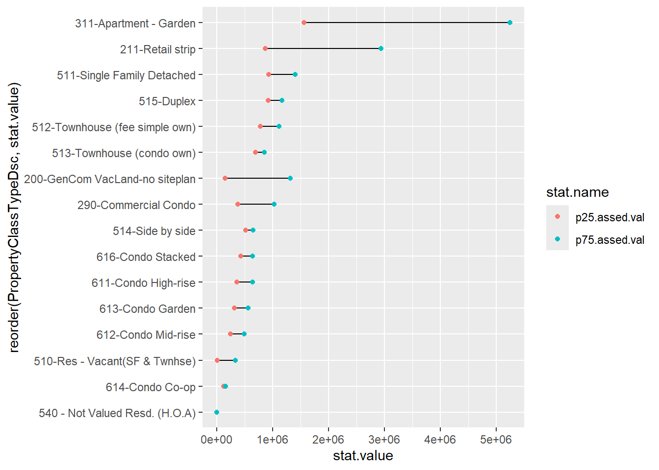
This graph has all the basics. Let’s do a little more clean-up on the overall look by getting commas in the scales and fixing the background with the theme() command.
## make it presentable
twocd <-
  ggplot(data = bypc.long[which(bypc.long$pnum != "50"
                                & bypc.long$obs > 200
                                & bypc.long$PropertyClassTypeDsc != "215-Gen Comm - other"),],
         aes(x = stat.value, y = reorder(PropertyClassTypeDsc, stat.value))) +
  geom_line(aes(group = PropertyClassTypeDsc)) +
  geom_point(aes(color = stat.name)) +
  scale_x_continuous(label=comma) +
  labs(y = "structure assessed value") +
  theme_minimal() +
  theme(axis.title = element_blank(),
        panel.grid.major.x = element_blank(),
        panel.grid.minor = element_blank(),
        legend.position = "none",
        plot.title = element_text(size = 20, margin = margin(b = 10)))
twocd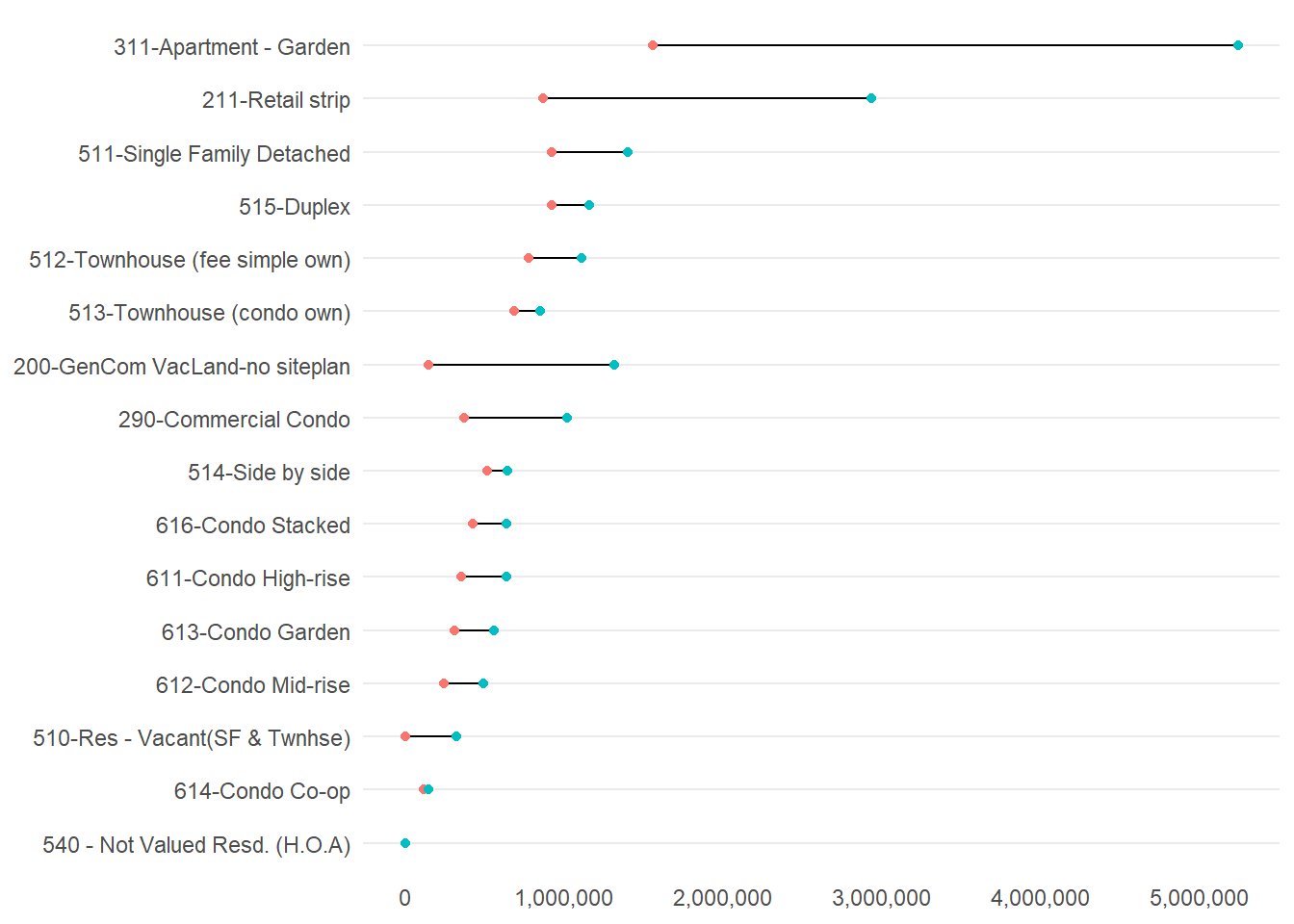
We could still do some fixes here. One key fix is labeling the 75th and 25th percentiles somewhere on the graph.
Some other concerns: Why these two colors? I think two shades of the same color might be more intuitive. I’d make the joining line less dark and distracting. I’d also look into the suspiciously high 75th percentile value (higher than for single family homes!) for garden apartments.
F. Homework
1
Use a density plot to evaluate whether residential or commercial structures have a greater variance in assessed value. To do this, I encourage you to use the facet_grid() we learned this class in combination with geom_density(). To discriminate between residential and commercial structures, use arl.p$CommercialInd.
2
Re-do the graph in section D that plots the average, the 25th percentile, and the 75th percentile of value by year built. Rather than plotting each year, plot each ten year period from 1900 to 2010. You can do this by taking an average for each decade, or by just taking the beginning or end of each decade. Add a legend for the 25th and 75th percentiles by color.
In case this seems overwhelming, here is the order of operations I followed:
- group the data
- summarize to the year level
- keep only decade years
- alternatively, create a decade variable and summarize by that
- keep only years >= 1900
- make the dataframe long
- plot it
3
Make a nice-looking scatter from a different dataset.
This is our ninth tutorial, posted for Lecture 11.↩︎