Tutorial 10: Interactive Graphics
Welcome to the final tutorial for Data Visualization Using R. Today we are taking the skills you’ve already learned about how to make graphs and extending those skills to interactive graphics.
Both in policy work and otherwise, if you are arguing for a specific point, the static graphic is your best bet. It allows you, rather than the user, to determine what it is shown and how the evidence is framed.
However, your goal is sometimes not structured communication, but rather data dissemination. In those cases, interactive graphics can be useful in letting readers find data on their own, or draw their own conclusions from underlying data.
R has an interactive graphic type called RShiny, but sadly the graphs it produces are not very good looking. Many of the interactive graphics you see on news websites are made by more bespoke packages. Today we will learn the basics of one of these packages called d3. No R!
Thank you to the folks at the University of Wisconsin and Google’s Gemini for helping me make today’s tutorial.
A. Introducing D3
A.1. What is D3 and what can it do?
D3 is a very flexible graph making software that creates graphs using javascript. It creates graphs for webpages, and we will take advantage of its capabilities to make interactive graphics.
You can find an official description of D3 here. You can find examples of the many complicated graphs you can make with D3 here.
This tutorial from the University of Wisconsin provides a much more detailed description of d3’s options and capabilities than we will cover in class.
A.2. What’s interactive in a d3 graph?
There are many ways to make a D3 graph interactive. You can select a data series from a list to appear on a bar chart. You can make names appear when you hover over points on a graph. You can change the variable on a graph axis.
Before you work through this tutorial, I strongly encourage you to look at at least two interactive examples.
Example 1: Earlier in the semester, we discussed how to normalize multiple time series to 1 at a given point in time to make comparisons. This interactive chart shows stock prices for five firms over time and lets the user choose the date at which you normalize the values to one.
Example 2: This is a dot plot, where the user can choose by which variable the chart is ordered. We will make an interactive graph that also allows users to choose an input component.
A.3. What’s useful in an interactive graph?
D3 offers many interactive graphs where the interactivity causes things to fly around. These are pretty and exciting, but I am not confident that they always aid communication. For readers to compare things, they need to see both things you are comparing at the same time.
Before you design an interactive graph, make sure you ask yourself what your goal is. For example, do you want readers to be able to identify individual data? This is a reasonable goal and today’s tutorial will show you how to use mouse-overs to do this. Do you want readers to be able to compare values from different variables or units to a baseline? We will do a version of this today.
Do you want to show a correlation via a scatter over time? You can use a slider to change the dots on a scatterplot over time.
None of these are explanatory graphics, but they are all potentially useful exploratory graphics and deserve a place in your toolkit.
B. Getting Started – Setting Up
In this section, we get all the needed parts up and running so that we can write a graph in Section C.
B.1. Get an New Code Editor
To work on files for this class, you need a code editor. I recommend VS Code, which you can download at here. This is sort of like RStudio, but it is for editing all kinds of code files—not just R code.
I installed VSCode using just the default options, and I encourage you to do the same.
If you want to use a different editor, this may be fine – but there is one wrinkle near the end that I have solved for VSCode but don’t know how to solve for other editors.
Do not use MS Word or a general text editor such as Notepad or TextEdit. These kind of editors sometimes add hidden formatting that screws up your code. And because it’s hidden, you can’t see it and therefore can’t find it.
B.2. Create a Project Folder
Before writing any code, you need a dedicated space for your files. D3 often requires multiple files (HTML and data in our case) to work together.
Make sure you know the full path of your new project folder. Ideally, this path will have no spaces in the name. Spaces in the name can cause trouble!
C. Make a Scatter
First we will make a scatter plot based on fake data and see it in a webpage. We’ll then update the graph with some actual data.
C.1. Make a new file with VS Code
Open VSCode. When opening for the first time, VSCode wants you to sign in. I ignored this and pressed “skip” at the bottom left.
Make a new empty file and save it in the directory you created in the Section B.2 (File > New File) above. Call the file something you’ll remember. I called mine first_scatter_example.html. The extension part of this naming (.html) is very important. If you forget it, nothing will work!
You have just created a html file. HTML–hypertext markup language–is the language of webpages. All the interactive graphics you create today will appear in a webpage.
C.2. Create a First D3 code file
Paste in the code below into the html file you created above and save.
<!-- A. html starting point -->
<!DOCTYPE html>
<html lang="en">
<head>
    <meta charset="UTF-8">
    <meta name="viewport" content="width=device-width, initial-scale=1.0">
    <title>D3 Scatter Plot</title>
    <script src="https://d3js.org/d3.v7.min.js"></script>
</head>

<!-- B. html body -->
<body>
    <!-- C. SVG set-up -->
    <svg width="400" height="400"></svg>
    <script>
        // D. Sample data with five points
        const scatterData = [
            { name: "New York", pop: 8.3, growth: 15 },
            { name: "Chicago", pop: 2.7, growth: 10 },
            { name: "Houston", pop: 2.3, growth: 25 },
            { name: "Phoenix", pop: 1.6, growth: 40 },
            { name: "Philadelphia", pop: 1.5, growth: 5 }
            ];

        // E. Set margins and dimensions
        const margin = { top: 20, right: 30, bottom: 40, left: 50 };
        const width = 400 - margin.left - margin.right;
        const height = 400 - margin.top - margin.bottom;

        // E, cont'd. Select the SVG element and set dimensions
        const svg = d3.select("svg")
            .attr("width", width + margin.left + margin.right)
            .attr("height", height + margin.top + margin.bottom);

        // F. Create a group for the chart area
        const g = svg.append("g")
            .attr("transform", `translate(${margin.left},${margin.top})`);

        // G. Define scales
        const xScale = d3.scaleLinear()
            .domain([0, d3.max(scatterData, d => d.pop)])
            .range([0, width]);

        const yScale = d3.scaleLinear()
            .domain([0, d3.max(scatterData, d => d.growth)])
            .range([height, 0]);

        // H. Add X axis
        g.append("g")
            .attr("transform", `translate(0,${height})`)
            .call(d3.axisBottom(xScale));

        // H cont'd. Add Y axis
        g.append("g")
            .call(d3.axisLeft(yScale));

        // I. Create circles for each data point
        g.selectAll("circle")                   // 1. Look for circles (there are none yet)
            .data(scatterData)                  // 2. Count the data points (there are 5)
            .enter()                            // 3. Create a placeholder for each missing circle
            .append("circle")                   // 4. Actually put the circle in the SVG
            .attr("cx", d => xScale(d.pop))     // Set X position based on population
            .attr("cy", d => yScale(d.growth))  // Set Y position based on growth
            .attr("r", 5)                       // Set radius of point to 5 pixels
            .style("fill", "steelblue");        // Fill in circle with steelblue color

        // J. Add X axis label
        svg.append("text")
            .attr("text-anchor", "middle") // Centers the text on its X-coordinate
            .attr("x", margin.left + width / 2) // X label goes halfway across the chart area
            .attr("y", height + margin.top + margin.bottom) // Y label goes at  the very bottom edge
            .text("Population (millions)"); // label itself

        // J, cont'd. Add Y axis label
        svg.append("text")
            .attr("text-anchor", "middle") // Centers the text on its Y-coordinate
            .attr("transform", "rotate(-90)") // Turn label sideways
            .attr("x", - (margin.top + height / 2)) // Moves it "up" (visually)
            .attr("y", margin.left / 2) // Moves it "left" (visually)
            .text("Growth (%)"); // label itself

    // K. Close everything up
    </script>
</body>
</html>
C.3. Look at the output
To look at the output, go to your favorite web browser. I am using Chrome, so these instructions should work for Chrome. Open a new tab. Then open a file in the new tab (ctrl + O on a PC, similar on a Mac). This brings up a window to navigate to your just-created file. Navigate to that file and open it.
Hopefully you see a graph like the one below 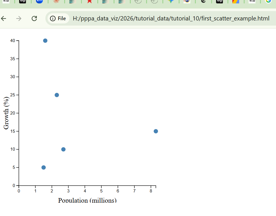 .
.
If you update your code and save your code, you can see an updated scatter by refreshing this webpage.
C.4. What is this code doing?
To understand the code above, we’ll break it into bits.
Before we look at the output from this, I’ll explain the contents step by step.
- HTML set-up
This section first tells the computer that you are writing a hypertext markup language (html) document, and that you’re writing it in English:
<!DOCTYPE html>
<html lang="en">
You can pick out html commands because they are always wrapped in <>. Commands begin like the word inside carrots, such as <body>, and end with the command with a blackslash inside carrots, such as </body>, which you can see at the very end of the code snippet.
This code <title>D3 Scatter Plot</title> makes a title at the top of the browser tab. If you want to change, feel free.
Then tell the computer that you’re using the d3 java script library with <script src="https://d3js.org/d3.v7.min.js"></script>. This part means that the browser will be able to interpret the d3 commands you’ll give.
<head>
  <meta charset="UTF-8">
  <meta name="viewport" content="width=device-width, initial-scale=1.0">
  <title>D3 Scatter Plot</title>
  <script src="https://d3js.org/d3.v7.min.js"></script>
</head>- HTML Body
The instruction tells the computer that you are starting the body of the html document: <body>. These are the things that are going to go onto the screen.
- SVG Set-up
In the next section, we set up a blank canvas that is 400 by 400 pixels. This is a blank container for the contents we will describe below. The tag <script> tells the browser that you are going to start on the java script d3 commands.
<!-- C. SVG set-up -->
<svg width="400" height="400"></svg>
<script>
D. Bring in data
Now that we are inside the java script part of the code, we note comments with //, as // D. Sample ...
We then define the data. For this first example, we create a five row dataset with cities, population and their growth right in this code. Later in the tutorial, we’ll bring in existing saved datasets.
// D. Sample data with five points
  const scatterData = [
          { name: "New York", pop: 8.3, growth: 15 },
          { name: "Chicago", pop: 2.7, growth: 10 },
          { name: "Houston", pop: 2.3, growth: 25 },
          { name: "Phoenix", pop: 1.6, growth: 40 },
          { name: "Philadelphia", pop: 1.5, growth: 5 }
];- Setting margins and dimensions
This section of the code makes a buffer around the canvas we defined in step C. If we didn’t have a buffer, the axis labels would be invisible. We define the margins at the top so we can change if we need to change the length of either axis.
// E. Set margins and dimensions
const margin = { top: 20, right: 30, bottom: 40, left: 50 };
const width = 400 - margin.left - margin.right;
const height = 400 - margin.top - margin.bottom;

// E, cont'd. Select the SVG element and set dimensions
const svg = d3.select("svg")
          .attr("width", width + margin.left + margin.right)
.attr("height", height + margin.top + margin.bottom);- Create an object for the graph
In regular math, the origin of (0,0) is at the bottom left. In browser math, the origin for describing location is the top left.
This bit of code creates an object g. The translate part of the function shifts the origin of the object from (0,0) at the top left to a margin-sized distance inside that origin.
      // F. Create a group for the chart area
      const g = svg.append("g")
.attr("transform", `translate(${margin.left},${margin.top})`);- Define scales
Here we define how the data will translate to the x and y axis.
In regular math, domain is usually the x values, and range the y values. In d3 world, the domain in the command below is the range of the data. Here for the x scale, we set the domain of the x variable as going from 0 to the max of the d.pop variable in scatterData.
We set the pixel width of the graph to be the width we defined above.
D3 then scales the graph so that the values fit inside the assigned pixel size.
The second command repeats for the y axis. Note that for the y axis, while domain values go from 0 to the max of d.growth in scatterData, the range goes from height (defined above) to zero. Recall that the browser believes that the top left is (0,0). To put zero values at the bottom, we need to invert the scale.
      // G. Define scales
      const xScale = d3.scaleLinear()
          .domain([0, d3.max(scatterData, d => d.pop)])
          .range([0, width]);

      const yScale = d3.scaleLinear()
          .domain([0, d3.max(scatterData, d => d.growth)])
.range([height, 0]);- Adding axes
In section H, we add to the object g. In the first section, transform pushes the axis we are defining to the bottom, rather than the top, of the chart. The next part of the section part adds a horizontal axis at the bottom (d3.axisBottom).
The second section adds a y axis at the left of the chart.
      // H. Add X axis
      g.append("g")
          .attr("transform", `translate(0,${height})`)
          .call(d3.axisBottom(xScale));

      // H cont'd. Add Y axis
      g.append("g")
.call(d3.axisLeft(yScale));- Create scatter circles
This is finally the part of the code that draws the points. I annotate each part below.
      // I. Create circles for each data point
      g.selectAll("circle")                   // 1. Look for circles (there are none yet)
          .data(scatterData)                  // 2. Count the data points (there are 5)
          .enter()                            // 3. Create a placeholder for each missing circle
          .append("circle")                   // 4. Actually put the circle in the SVG
          .attr("cx", d => xScale(d.pop))     // Set X position based on population
          .attr("cy", d => yScale(d.growth))  // Set Y position based on growth
          .attr("r", 5)                       // Set radius of point to 5 pixels
.style("fill", "steelblue"); // Fill in circle with steelblue color- Add labels for axes
This may be the most straightforward part! Here we place the axis label text.
// J. Add X axis label
      svg.append("text")
          .attr("text-anchor", "middle") // Centers the text on its X-coordinate
          .attr("x", margin.left + width / 2) // X label goes halfway across the chart area
          .attr("y", height + margin.top + margin.bottom) // Y label goes at  the very bottom edge
          .text("Population (millions)"); // label itself

// J, cont'd. Add Y axis label
      svg.append("text")
          .attr("text-anchor", "middle") // Centers the text on its Y-coordinate
          .attr("transform", "rotate(-90)") // Turn label sideways
          .attr("x", - (margin.top + height / 2)) // Moves it "up" (visually)
          .attr("y", margin.left / 2) // Moves it "left" (visually)
          .text("Growth (%)"); // label itself
K. Close everything up
The final section here closes all the tabs. </script> tells the computer that the container for the graph is closing. The </body> tag tells the computer the content is done, and </html> says that the webpage is done.
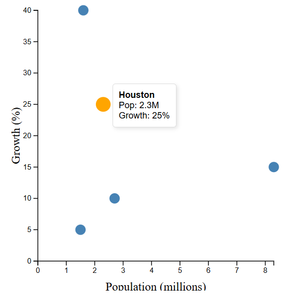
C.5. Make the scatter interactive
The graph you just made is a static graph – not very much different from the graphs we made with ggplot. The benefit of D3 is in interactivity, and we now turn to such an interactive graph.
We’ll start simply by modifying the previous graph so that you can see the city and (x,y) values for points as you mouse over them. I wanted to highlighted the additional lines we added, but I can’t figure out how to get this to work!
So, please pay close attention to lines
- 9-20: these add the “tooltip”
- 26: alerts browser that you’re using tooltip
- 53-54: defines tooltip for D3 figure
- 83-111: defines what happens when you mouse-over
To run this, go to VSCode and open a new window (File > New File). Save this file as a html file, just as you did before, in the same folder you created above. I called mine interactive_scatter_example.html.
Open a new browser tab. Use ctrl+O to open the file you just created as you did above. When you mouse over each dot, you should be able to see the value for the point, as in my picture below.
Code for this step:
<!DOCTYPE html>
<html lang="en">
<head>
    <meta charset="UTF-8">
    <meta name="viewport" content="width=device-width, initial-scale=1.0">
    <title>D3 Scatter Plot with Tooltips</title>
    <script src="https://d3js.org/d3.v7.min.js"></script>

    <style>
        #tooltip {
            position: absolute;
            opacity: 0; /* Hidden by default */
            background-color: white;
            border: 1px solid #ddd;
            padding: 8px;
            border-radius: 4px;
            pointer-events: none; /* Prevents the tooltip from flickering under the mouse */
            font-family: sans-serif;
            font-size: 12px;
            box-shadow: 2px 2px 5px rgba(0,0,0,0.1);
        }
    </style>
</head>

<body>
    <div id="tooltip"></div>

    <svg width="400" height="400"></svg>

    <script>
        // D. Sample data
        const scatterData = [
            { name: "New York", pop: 8.3, growth: 15 },
            { name: "Chicago", pop: 2.7, growth: 10 },
            { name: "Houston", pop: 2.3, growth: 25 },
            { name: "Phoenix", pop: 1.6, growth: 40 },
            { name: "Philadelphia", pop: 1.5, growth: 5 }
        ];

        // E. Set margins and dimensions
        const margin = { top: 20, right: 30, bottom: 40, left: 50 };
        const width = 400 - margin.left - margin.right;
        const height = 400 - margin.top - margin.bottom;

        const svg = d3.select("svg")
            .attr("width", width + margin.left + margin.right)
            .attr("height", height + margin.top + margin.bottom);

        // F. Create a group for the chart area
        const g = svg.append("g")
            .attr("transform", `translate(${margin.left},${margin.top})`);

        // NEW: Select the tooltip div
        const tooltip = d3.select("#tooltip");

        // G. Define scales
        const xScale = d3.scaleLinear()
            .domain([0, d3.max(scatterData, d => d.pop)])
            .range([0, width]);

        const yScale = d3.scaleLinear()
            .domain([0, d3.max(scatterData, d => d.growth)])
            .range([height, 0]);

        // H. Add axes
        g.append("g")
            .attr("transform", `translate(0,${height})`)
            .call(d3.axisBottom(xScale));

        g.append("g")
            .call(d3.axisLeft(yScale));

        // I. Create circles with interaction
        g.selectAll("circle")
            .data(scatterData)
            .enter()
            .append("circle")
            .attr("cx", d => xScale(d.pop))
            .attr("cy", d => yScale(d.growth))
            .attr("r", 7) // Slightly larger for easier hovering
            .style("fill", "steelblue")
            .style("cursor", "pointer")
            // --- NEW: Interaction Logic ---
            .on("mouseover", function(event, d) {
                // 1. Highlight the circle
                d3.select(this)
                  .transition().duration(100)
                  .attr("r", 10)
                  .style("fill", "orange");

                // 2. Show the tooltip near the point
                tooltip.transition().duration(200).style("opacity", 1);
                tooltip.html(`<strong>${d.name}</strong><br>Pop: ${d.pop}M<br>Growth: ${d.growth}%`)
                    .style("left", (event.pageX + 10) + "px") // Near the mouse X
                    .style("top", (event.pageY - 28) + "px"); // Near the mouse Y
            })
            .on("mousemove", function(event) {
                // 3. Move the tooltip as the mouse moves
                tooltip.style("left", (event.pageX + 10) + "px")
                       .style("top", (event.pageY - 28) + "px");
            })
            .on("mouseout", function() {
                // 4. Return the circle to normal
                d3.select(this)
                  .transition().duration(100)
                  .attr("r", 7)
                  .style("fill", "steelblue");

                // 5. Hide the tooltip
                tooltip.transition().duration(200).style("opacity", 0);
            });

        // J. Labels (X and Y)
        svg.append("text")
            .attr("text-anchor", "middle")
            .attr("x", margin.left + width / 2)
            .attr("y", height + margin.top + margin.bottom)
            .text("Population (millions)");

        svg.append("text")
            .attr("text-anchor", "middle")
            .attr("transform", "rotate(-90)")
            .attr("x", - (margin.top + height / 2))
            .attr("y", margin.left / 2)
            .text("Growth (%)");

    </script>
</body>
</html>
E. Make an interactive line chart
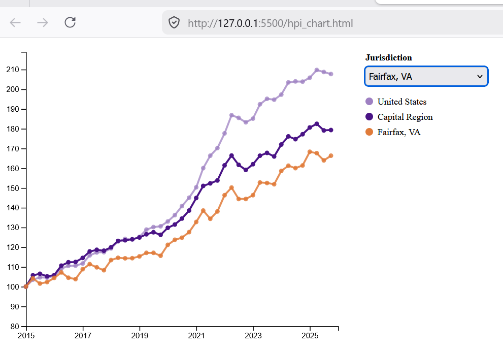
The last major section of this tutorial shows how to make an interactive line chart that relies on datasets external to the code. We need to do one additional set-up to make sure that security settings allow you to access these data external to the code.
For this example, we are using home price index data that RA Amelia Mansfield and I created for the 2026 State of the Capital Region report (forthcoming!). The graph will always show the national and regional (Washington metropolitan statistical area) home prices over time , and allows users to add home prices for one additional local jurisdiction.
Unlike in the previous section, I won’t discuss all the ins and outs of the D3 code. However, in the following section I’ll discuss how I used AI to generate plots like these.
To get the interactive chart to work, follow these steps in the order written. Things may go haywire if you deviate!
- Create a new folder for this part of the assignment. Both the folder and the entire path should have no spaces in the name.
- Download the three data files we’ll use and save in the folder you created in the previous step.
- National house price index
- Regional house price index
- House price index by jurisdiction
- Open VS Code
- Create a new file: File > New File > press enter in the blank box and a new window opens.
- Copy the code below and paste into the window you just opened.
- Save the file with a name you remember in the folder you created in step 1. Do not include spaces in the name! I named mine hpi_chart.html
- Close the file (File > Close Window)
- Press Ctrl+Shift+X (or go to View > Extensions) to open the Extensions view.
- In the search bar, look for “live server”.
- Click on the extension “live server” by Ritwick Dey (publisher: ms-vscode) and click “Install”.
- Quit VS Code
- Re-start VS Code (this quitting and restarting makes sure that the extension is properly installed)
- Open the folder that contains the file you just created (important that you open the folder and not the file; this may not work if you just open the file): File > open folder. Choose the folder that your file is in. After you open the folder, you should see a list of files on the left of the screen.
- From the list of files on the left, look for the html file you saved in step 5. Right-click the html file and you should see an option called “Open with Live Server”. Choose this option.
- A browser window should open with a graph that looks like this figure below.
Code to copy into your VS Code window:
<!DOCTYPE html>
<meta charset="utf-8">

<!-- Load d3.js -->
<script src="https://d3js.org/d3.v4.js"></script>
<script src="https://d3js.org/d3-scale-chromatic.v1.min.js"></script>

<style>
  body { display: flex; align-items: flex-start; gap: 16px; }
  #my_dataviz { flex-shrink: 0; }
  #controls {
    padding-top: 10px;
    display: flex;
    flex-direction: column;
    gap: 4px;
  }
  #controls label { font-size: 12px; font-weight: bold; margin-bottom: 2px; }
  #jur-select {
    font-size: 12px;
    padding: 4px;
    border: 1px solid #ccc;
    border-radius: 4px;
    width: 160px;
  }
</style>

<div id="my_dataviz"></div>
<div id="controls">
  <label>Jurisdiction</label>
  <select id="jur-select">
    <option value="">— Select —</option>
  </select>
  <div style="margin-top:10px; display:flex; flex-direction:column; gap:6px; font-size:12px;">
    <div style="display:flex; align-items:center; gap:6px;">
      <div style="width:10px;height:10px;border-radius:50%;background:#9e80c2;"></div>
      <span>United States</span>
    </div>
    <div style="display:flex; align-items:center; gap:6px;">
      <div style="width:10px;height:10px;border-radius:50%;background:#4a1486;"></div>
      <span>Capital Region</span>
    </div>
    <div id="legend-jur" style="display:none; align-items:center; gap:6px;">
      <div style="width:10px;height:10px;border-radius:50%;background:#e07b39;"></div>
      <span id="legend-jur-name"></span>
    </div>
  </div>
</div>

<script>

var margin = {top: 10, right: 20, bottom: 30, left: 30},
    width  = 460 - margin.left - margin.right,
    height = 400 - margin.top  - margin.bottom;

// Define chart margins and compute inner width/height
var svg = d3.select("#my_dataviz")
  .append("svg")
    .attr("width",  width  + margin.left + margin.right)
    .attr("height", height + margin.top  + margin.bottom)
  .append("g")
    .attr("transform", "translate(" + margin.left + "," + margin.top + ")");

// Queue all three CSVs to load in parallel before rendering
d3.queue()
  .defer(d3.csv, "hpi_capital_region_20260324.csv")
  .defer(d3.csv, "hpi_national_20260324.csv")
  .defer(d3.csv, "hpi_jurisdictions_20260405.csv")
  .await(function(error, capitalData, nationalData, jurData) {

    if (error) throw error;

    // Parse capital region dates (must be in local time) and cast numeric fields
    capitalData.forEach(function(d) {
      d.date     = d3.timeParse("%Y-%m-%d")(d.date);
      d.index    = +d.index;
      d.ci_lower = d.ci_lower ? +d.ci_lower : null;
      d.ci_upper = d.ci_upper ? +d.ci_upper : null;
    });

    // Parse national dates and cast index to number
    nationalData.forEach(function(d) {
      d.date     = d3.timeParse("%Y-%m-%d")(d.date);
      d.index = +d.index;
    });

    // Parse jurisdiction dates and cast numeric fields
    jurData.forEach(function(d) {
      d.date     = d3.timeParse("%Y-%m-%d")(d.date);
      d.index    = +d.index;
      d.ci_lower = d.ci_lower ? +d.ci_lower : null;
      d.ci_upper = d.ci_upper ? +d.ci_upper : null;
    });

var cutoff = new Date(2025, 11, 31).getTime();
capitalData = capitalData.filter(function(d) { return d.date.getTime() <= cutoff; });
nationalData = nationalData.filter(function(d) { return d.date.getTime() <= cutoff; });
jurData = jurData.filter(function(d) { return d.date.getTime() <= cutoff; });


    // Group jurisdiction rows by county FIPS code
    var jurNested = d3.nest()
      .key(function(d) { return d.county_fips_full; })
      .entries(jurData);

    // Sort alphabetically by name
    jurNested.sort(function(a, b) {
      var na = a.values[0].county_name || a.key;
      var nb = b.values[0].county_name || b.key;
      return na.localeCompare(nb);
    });

    // X axis
    // Define time scale spanning 2015–2025 mapped to chart width
    var x = d3.scaleTime()
      .domain([new Date(2015, 0, 1), new Date(2025, 11, 31)])
      .range([0, width]);
    // Draw x-axis with manual biennial tick marks labeled by year
    svg.append("g")
      .attr("transform", "translate(0," + height + ")")
      .call(d3.axisBottom(x)
        .tickValues([
            new Date(2015, 0, 1),
            new Date(2017, 0, 1),
            new Date(2019, 0, 1),
            new Date(2021, 0, 1),
            new Date(2023, 0, 1),
            new Date(2025, 0, 1)
        ])
        .tickFormat(d3.timeFormat("%Y")));

    // Y axis
    // Define linear y scale from 80 to 5% above the capital region peak
    var y = d3.scaleLinear()
      .domain([80, d3.max(capitalData, function(d) { return d.index; }) * 1.20])
      .range([height, 0]);
    // Draw y-axis on the left
    svg.append("g")
      .call(d3.axisLeft(y));

    // Line generator
    // Define line generator using x/y scales, skipping null index values
    var line = d3.line()
      .x(function(d) { return x(d.date); })
      .y(function(d) { return y(d.index); })
      .defined(function(d) { return d.index != null; });

   // --- National line + dots ---
    // Draw national line in light purple
    svg.append("path")
      .datum(nationalData)
      .attr("fill", "none")
      .attr("stroke", "#9e80c2")
      .attr("stroke-width", 2.5)
      .attr("opacity", 0.75)
      .attr("d", line);

    // Dots
    svg.selectAll(".dot-national")
      .data(nationalData)
      .enter()
      .append("circle")
        .attr("class", "dot-national")
        .attr("cx", function(d) { return x(d.date); })
        .attr("cy", function(d) { return y(d.index); })
        .attr("r", 3)
        .attr("fill", "#9e80c2")
        .attr("opacity", 0.75);

    // --- Capital region line + dots (on top) ---
    // Draw capital region line in dark purple on top of jurisdiction layer
    svg.append("path")
      .datum(capitalData)
      .attr("fill", "none")
      .attr("stroke", "#4a1486")
      .attr("stroke-width", 2.5)
      .attr("d", line);

    svg.selectAll(".dot-capital")
      .data(capitalData)
      .enter()
      .append("circle")
        .attr("class", "dot-capital")
        .attr("cx", function(d) { return x(d.date); })
        .attr("cy", function(d) { return y(d.index); })
        .attr("r", 3)
        .attr("fill", "#4a1486");


      // make orange for now
    var jurColor = "#e07b39";

    // Pre-append hidden path that will be populated on dropdown selection
    var jurLinePath = svg.append("path")
      .attr("fill", "none")
      .attr("stroke", jurColor)
      .attr("stroke-width", 2.5)
      .attr("opacity", 0);

    // Group element to hold jurisdiction dots, cleared on each selection change
    var jurDots = svg.append("g").attr("class", "jur-dots");

    // Redraw jurisdiction line, dots, and label for the given FIPS; hide all if empty
    function showJurisdiction(fips) {
      if (!fips) {
        jurLinePath.attr("opacity", 0);
        jurDots.selectAll("circle").remove();
        document.getElementById("legend-jur").style.display = "none";
        return;
      }

      // Find the nested data group matching the selected FIPS
      var jur = jurNested.find(function(j) { return j.key === fips; });
      if (!jur) return;

      var vals = jur.values;
      // Use county_name from CSV if present, otherwise fall back to FIPS
      var name = vals[0].county_name || fips;
document.getElementById("legend-jur").style.display = "flex";
document.getElementById("legend-jur-name").textContent = name;


      // line
      // Bind data and draw the jurisdiction line path
      jurLinePath
        .datum(vals)
        .attr("opacity", 0.85)
        .attr("d", line);

      // dots
      // Remove old dots then draw one circle per data point
      jurDots.selectAll("circle").remove();
      jurDots.selectAll("circle")
        .data(vals)
        .enter()
        .append("circle")
          .attr("cx", function(d) { return x(d.date); })
          .attr("cy", function(d) { return y(d.index); })
          .attr("r", 3)
          .attr("fill", jurColor)
          .attr("opacity", 0.85);
    }

    // populate dropdown
    // with one option per jurisdiction, sorted alphabetically
    var select = document.getElementById("jur-select");
    jurNested.forEach(function(jur) {
      var opt = document.createElement("option");
      opt.value = jur.key;
      opt.text  = jur.values[0].county_name || jur.key;
      select.appendChild(opt);
    });

    // Call showJurisdiction whenever the dropdown selection changes to redraw the chart with the selected jurisdiction's data (or hide if empty)
    select.addEventListener("change", function() {
      showJurisdiction(this.value);
    });


  });

</script>
F. Using AI to make these graphs
I largely wrote this tutorial by telling Claude or Gemini that I wanted to make a D3 graph with certain features. I also used the AI inside VSCode itself for additional help.
If you want to make this kind of interactive graph, I suggest that you first figure out what it is you want to do, given what’s feasible. You can do the latter by looking at D3 examples.
Then ask your favorite AI to create a basic code you’d like. Then edit by adding to the code, piece by piece.
If you have code that doesn’t work, you can put the entire code into Claude or Gemini and ask for help.
G. Review
Make an interactive graphic of your choice. I strongly encourage you to do this with the help of AI.
I don’t recommend this for your policy brief, which should be a static document. But an interactive graphic can be great if you’re making a policy brief and want to provide detailed information for readers at the end. It can also be great if you want to show a relationship via a scatter (or even other types of graphs) and want readers to be able to identify individual points.