install.packages("shiny", dependencies = TRUE)Tutorial 10: Interactive Graphics
Welcome to the final tutorial for Data Visualization Using R. Today we are taking the skills you’ve already learned about how to make graphs and extending those skills to interactive graphics.
Both in policy work and otherwise, if you are arguing for a specific point, the static graphic is your best bet. It allows you, rather than the user, to determine what it is shown and how the evidence is framed.
However, sometimes your goal is not structured communication, but rather data dissemination. In those cases, interactive graphics can be useful in letting readers find data on their own, or draw their own conclusions from underlying data.
In this tutorial, we learn how to create interactive graphics with a package called Shiny. You’ll learn how to build a webpage where users can input information and the graphic changes in response. In this class we’ll learn how to build this Shiny app, and we’ll make a weblink for dissemination. You all will send me your weblinks, and I’ll create a page with your work. You can find more details on how to deploy Shiny apps on this page.
To get a sense of where we are going, here is a RShiny app that my research assistant wrote for a recent project of mine. In short, you choose a jursidiction and an outcome, and the app produces a graph for your jurisdiction.
A. Get things ready
A.1. Prepping R
For today’s tutorial, you’ll need to install the “shiny” package. Do this only once (do not put it in your R script):
A word of warning: pay very careful attention when this tutorial tells you to create a new directory for files. This is not a suggestion, it is a requirement. Shiny is very particular about how files are named. Things will go totally haywire if you do not create new directories as needed.
In addition to the shiny package, today’s tutorial also relies on the tidyverse package, so now load both of these packages.
# load the library
library(shiny)
library(tidyverse)
A.2. Additional resources
Today we learn the very minimal basics of Shiny. In writing today’s tutorial, I referred to at least three helpful additional tutorials or pages:
If you would like to learn more, I would start with these.
B. Look at some examples
Before we get started, it’s helpful to see where we are heading. You should have already installed the Shiny package and called it using library(). Once you’ve installed and loaded the package, you have access to a set of examples that RStudio created to show you what Shiny does.
There are 11 examples in total. To look at the first one, type
runExample("01_hello")This will pop up a new window that should look like the picture below: 
The top part – the bin choosing slider and the graph – are what you’ll see when you write your Shiny code. For purposes of this example, the developers also show you the code that makes this example at the bottom. I recommend that you look this over as well, but don’t worry too much about it. We’ll go through code more carefully later. First, I want to make sure you know what Shiny does.
To that end, play with the bar at the left that tells R the number of bins to use for the histogram. See how the graph changes? This is at the heart of what Shiny does: it takes a user determined input and makes an output based on it.
Or, as this page says similarly: “The Shiny web framework is fundamentally about making it easy to wire up input values from a web page, making them easily available to you in R, and have the results of your R code be written as output values back out to the web page.” User input in: graph or calculations out.
Now that you’ve looked at the first example, I recommend that you browse at least one or two more. Here is the complete list.
runExample("01_hello")      # a histogram
runExample("02_text")       # tables and data frames
runExample("03_reactivity") # a reactive expression
runExample("04_mpg")        # global variables
runExample("05_sliders")    # slider bars
runExample("06_tabsets")    # tabbed panels
runExample("07_widgets")    # help text and submit buttons
runExample("08_html")       # Shiny app built from HTML
runExample("09_upload")     # file upload wizard
runExample("10_download")   # file download wizard
runExample("11_timer")      # an automated timer
If you’re up for more, there are lots of examples on this page. There’s one on COVID (and then click on “view app”) that is probably the best match for the types of things we do in this class.
C. Structure of a Shiny App
Now that you know what a Shiny App can do, we’ll start work on building one of our own.
Each Shiny app that you create has two key parts: a ui function and a server function. The ui part determines what the user sees. The server part creates outputs (for what the user sees) from the user-given inputs.
All Shiny apps have to be saved as app.R. This means that if you’re making multiple apps, as we will in today’s class each app needs its own directory. This is so important that I will repeat! Each app you create
- must be named app.R and
- be saved in its own directory
The very simplest Shiny app – and this one does nothing – has four lines, as below. The first line loads the Shiny package. The second line defines the user interface (ui). The third line tells the computer what output to produce from the user input (server) and the final line calls the two parts you just defined.
Do not try to run this program in the console window. This is just to give you a sense of how the app gets set up.
# 1. load package
library(shiny)
# 2. define user interface
ui.def <- fluidPage()
# 3. define computed output to user interface
server.def <- function(input, output){}
# 4. call the app
shinyApp(ui = ui.def,
         server = server.def)
This is the basic outline. In the next step, we’ll make a minimal example.
D. Make a Tiny Shiny App
You’re now ready to make a very small Shiny app to get a sense of how things work. We will do this in two steps. First we’ll prepare the Arlington property data from last tutorial to make the app building easier and faster. Then we’ll write a tiny Shiny app and run it.
D.1. Prepare the Arlington property data
Our goal here is to create a small dataframe to make the data load faster when we run the Shiny app.
We’ll use the Arlington properties data file from Tutorial 9. If you don’t have this file, you can download it from here.
We want to do a few things with these data to prepare them
- clean up the year built variable to a plausible range
- create a variable that is the log of assessed value
- limit the variables in the dataframe
- save the dataframe as a R dataset
Hopefully the first three items on this list are things you already know how to do. I list these steps below.
# prep the arlington property data for this exercise
arl.p <- read.csv("h:/pppa_data_viz/2025/tutorial_data/tutorial_09/arlington_prop_data_merged_20250414.csv")
names(arl.p)
[1] "RealEstatePropertyCode" "ever.delinquent"
[3] "AssessmentKey" "ProvalLrsnId.x"
[5] "AssessmentChangeReasonTypeDsc" "AssessmentDate"
[7] "ImprovementValueAmt" "LandValueAmt"
[9] "TotalValueAmt" "assmt.year"
[11] "PropertyKey" "ProvalLrsnId.y"
[13] "ReasPropertyStatusCode" "PropertyClassTypeCode"
[15] "PropertyClassTypeDsc" "LegalDsc"
[17] "LotSizeQty" "MapBookPageNbr"
[19] "NeighborhoodNbr" "PolygonId"
[21] "PropertyStreetNbrNameText" "PropertyStreetNbr"
[23] "PropertyStreetNbrSuffixCode" "PropertyStreetDirectionPrefixCode"
[25] "PropertyStreetName" "PropertyStreetTypeCode"
[27] "PropertyStreetDirectionSuffixCode" "PropertyUnitNbr"
[29] "PropertyCityName" "PropertyZipCode"
[31] "GisStreetCode" "PhysicalAddressPrimeInd"
[33] "ZoningDescListText" "FirstOwnerName"
[35] "SecondOwnerName" "AdditionalOwnerText"
[37] "TradeName" "OwnerStreetText"
[39] "OwnerCityName" "OwnerStateCode"
[41] "OwnerZipCode" "CompressedOwnerText"
[43] "PropertyYearBuilt" "GrossFloorAreaSquareFeetQty"
[45] "EffectiveAgeYearDate" "NumberOfUnitsCnt"
[47] "StoryHeightCnt" "ValuationYearDate"
[49] "CommercialPropertyTypeDsc" "EconomicUnitNbr"
[51] "CondoModelName" "CondoStyleName"
[53] "FinishedStorageAreaSquareFeetQty" "StorageAreaSquareFeetQty"
[55] "UnitNbr" "ReasPropertyOwnerKey"
[57] "ArlingtonStreetKey" "PropertyExpiredInd"
[59] "MixedUseInd" "CommercialInd"
[61] "DistrictNbr" "TaxExemptionTypeDsc"
[63] "CondominiumProjectName" "MasterRealEstatePropertyCode"
[65] "StreetNbrOrder" "ResourceProtectionAreaInd"
[67] "LandRecordDocumentNbr" "StatePlaneXCrd"
[69] "StatePlaneYCrd" "LatitudeCrd"
[71] "LongitudeCrd" "PhysicalAddressKey"
[73] "PropertyStormWaterInd" "CondoPatioAreaSquareFeetQty"
[75] "CondoDenCnt" "CondoOpenBalconySquareFeetQty"
[77] "CondoEnclosedBalconySquareFeetQty" "CondoParkingSpaceIdListText"
[79] "CondoStorageSpaceIdListText" "MaskOwnerAddressInd" # clean up year built variable
arl.p.toshiny <- filter(.data = arl.p, PropertyYearBuilt > 1875)
# make log of assessed property value for use later
arl.p.toshiny$ln.TotalValueAmt <- log(arl.p.toshiny$TotalValueAmt)
# limit to just these variables to make it smaller
arl.p.toshiny <- select(.data = arl.p.toshiny,
c("RealEstatePropertyCode","PropertyYearBuilt",
"TotalValueAmt","ln.TotalValueAmt"))
# check size
dim(arl.p.toshiny)[1] 62730 4Now that we have a smaller cleaned dataframe, the last step is to save it. We save it as a R dataset so we can quickly load it. We save R datasets with the saveRDS() command which takes (at least) two inputs: the object (dataframe) you want to save and the location to which you want to save that object (file =).
saveRDS(object = arl.p.toshiny,
        file = "H:/pppa_data_viz/2025/tutorial_data/tutorial_10/small_arlington_2024_20250421.rds")
When you want to retrieve this dataframe – as we will below – you use the complementary readRDS() command.
D.2. Make a Shiny App
Now that the Arlington data are ready, we are ready to write our first Shiny app. Before writing the app, create a new directory in which to save the app. Recall that this app should be a directory with no other apps. When you make additional apps later in the tutorial, do not save them in this directory.
My new directory is called H:/pppa_data_viz/2025/tutorial_data/tutorial_10/first_shiny_app.
Now, open a new R window. Save this new file as app.R in the new folder that you just created.
Now you have an empty file called app.R that you need to fill up with commands. For your first file, type what I have below.
Let me describe the parts. First we load the shiny and tidyverse packages. We need the shiny package to make a Shiny app. We use the tidyverse package to get access to ggplot and dplyr and many other useful packages.
Under 2 below, we define the user interface. I assign the user interface the name ui.stuff.that.shows, and you can re-name as you please. The function <- fluidPage() cannot change, but what you assign it to is your choice.
This basic user interface, inside fluidPage() has three parts. The first is a title, which is defined by titlePanel(). All title text goes inside this command with quotes around it.
The second element of the user interface is the function to create a slider that takes user input. The function sliderInput() is pre-set by the Shiny package. The first element of this function is the inputID element. This is the name that you define (that you can use elsewhere in this program) for the input that the user gives with the slider. So, for example, if the user slides the little bar on the slider to 20, input$bins is equal to 20.
The remaining parts of the slider definition are the label you put on top of the slider (label=), the minimum and maximum number of bins allowed by the slider (min and max) and the default value at which the slider starts (value).
The final element of the user interface is a plot. Confusingly, this is the plot we create in step 3 (the server function). We name the plot we create in step 3 distPlot and then we refer to it here to put it into the user interface.
And that brings us to the server function, labeled as step 3 below. This is a regular R function with two inputs, input and output, and it assigns to server.stuff.that processes. You can change the name to which the function assigns, and you can change the name of the inputs – but I would not until you are rather more experienced!
Inside the server function, there is a helper function called renderPlot(). To show output based on the user-defined input you need to “render” something. You can render a plot, a table, or probably many other things about which I don’t know.
Here, in the server function we
- load the Arlington data, using
readRDS()and referring to the path in which we saved it earlier - create a histogram of the year the structure on each property was built
Note that in this second step, the number of bins is set equal to input$bins, which the user defined in the user interface. Apart from value that changes with user input, everything about the historgram stays constant in each drawing.
Finally, we tell R that we have assembled the parts of the app by writing the final line
shinyApp(ui = ui.stuff.that.shows, server = server.stuff.that.processes)Note that the inputs into shinyApp() are the two function names we have chosen in writing this app.
So, to recap, type the code below in a new directory (the name of which you need to remember), and save it as app.R..
# 1. load packages
library(shiny)
library(tidyverse)

# 2. UI
# Define UI for app that draws a histogram ----
ui.stuff.that.shows <- fluidPage(

  # App title ----
  titlePanel("Hello Shiny!"),

  # Input: Slider for the number of bins ----
  sliderInput(inputId = "bins",
              label = "Number of bins:",
              min = 1,
              max = 50,
              value = 30),

  # Output: Histogram ----
  plotOutput(outputId = "distPlot")

)

# 3. server
#Define server logic required to draw a histogram ----
server.stuff.that.processes <- function(input, output) {

    # This expression that generates a histogram is wrapped in a call
    # to renderPlot to indicate that:
    #
    # 1. It is "reactive" and therefore should be automatically
    #    re-executed when inputs (input$bins) change
    # 2. Its output type is a plot
    output$distPlot <- renderPlot({

      dats <- readRDS("H:/pppa_data_viz/2025/tutorial_data/tutorial_10/small_arlington_2024_20250421.rds")

      ggplot() +
        geom_histogram(data = dats,
                       mapping = aes(x = PropertyYearBuilt),
                       bins = input$bins) +
        labs(title = "Number of Properties by Year Built",
             x = "Year Structure on Property was First Constructed",
             y = "Number of Properties")


    })

  }

# 4. Define app
shinyApp(ui = ui.stuff.that.shows, server = server.stuff.that.processes)
D.3. Run the Shiny App
Having just created the app, you’re now ready to run it. To run it, make yourself a new R script in the same directory as your new app. I’m calling my new script run_the_app.R. This new script has one line of code, as below:
runApp("[directory where you saved app.R]")So for me, this is
runApp("H:/pppa_data_viz/2025/tutorial_data/tutorial_10/first_shiny_app")Now, do not run run_the_app.R. Instead, highlight this particular line of code and run just this line. Run just this line by going to the Code menu and choosing Run Selected Line(s).
Alternatively, you can type the runApp() function directly at the console. I prefer saving this line in a file so I can re-run easily and so I have it for future reference.
Therefore, I typed the below in my R program and ran just this line:
runApp("H:/pppa_data_viz/2025/tutorial_data/tutorial_10/first_shiny_app")Then a screen pops up that looks like the picture below. When I change the value of the slider, the number of bins on the histogram changes. 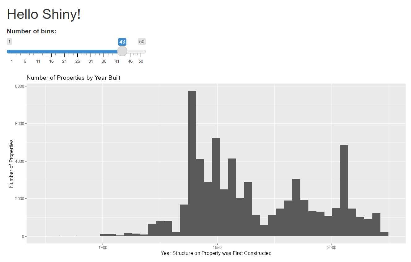
Note that your console is busy while you’re running this app, so you can’t run any other programs. When you’re done look at your new app, make sure you quit out of the Shiny window. If you don’t quit the Shiny window, you won’t be able to run anything else.
E. A Slightly More Sophisticated User Interface
In step D, we created the bones of a Shiny app. Now, in step E, we are going to add to the user interface. In section F we will add to the server output.
In this section, we will first add text to the user interface in E.1. and then add another input widget in E.2.
Here and for the rest of the tutorial, you may find the R Shiny cheatsheet helpful.
E.1. Add text and sections
We start by adding text to the user interface. This is non-interactive text – text that gives general context to the user and explains what you are asking them to input.
We are also going to add a grey box, in a separate section, to the interface. We’ll use the grey box, called a sidebar, to separate out where the user changes values.
All the text that you want to show up for users – either in the sidebar or elsewhere – on your Shiny app needs to be inside some kind of command. If you know HTML, these commands parallel HTML commands. If you don’t know HTML, don’t worry about it – just take a look at how the commands are structured, and you’ll get a sense of how the input is set up.
Here are two commands that are helpful in entering text. There are zillions more, but I think this is enough for today!
p()surrounds each paragraphbr()is a line break
For the millions of other commands, see the UI section of the cheatsheet linked above.
One way to make text easier for the reader is to separate the widget where the user enters. In the “Layouts” section of the cheatsheet, you can see the sidebarLayout() option that we’ll use today, along with the many other options that you could choose. In essence, you tell R that you’re going to use a sidebar layout and then you need to tell R, through the two subparts, what goes in the sidebar panel (sidebarPanel()) and what goes in the main panel (mainPanel()).
With all that said, now let’s revise our app.R program to have this updated user interface. The first thing to do is to create a new directory for our new program (so we preserve the old one). I call my new subdirectory improved_ui.
The updated app.R file reads as below. We are changing text only in the user interface section.
# this is the app.r in improved_ui

# 1. load packages
library(shiny)
library(tidyverse)

# 2. UI
# Define UI for app that draws a histogram ----
ui.stuff.that.shows <- fluidPage(

  # App title ----
  titlePanel("Analysis of Arlington Properties"),

  # you cant just put random text in this part. it needs to be inside some kind of directions
  sidebarLayout(

    sidebarPanel(

      p("This is the sidebar panel, where we have chosen to gather inputs."),

      # Input: Slider for the number of bins ----
      sliderInput(inputId = "bins",
                  label = "Number of bins:",
                  min = 1,
                  max = 50,
                  value = 30)
    ),
    mainPanel(

      p("This is the main panel."),
      br(),
      p("Here we gather some input from you, dear reader, about what you'd like to learn
        about Arlington County."),
      br(),
      p("And we also put the inputs into a little box called a sidebar."),
      br(),
      p("Look at the sidebar layout bit on the cheat sheet to see what it's doing.
        It has a sidebar and a main part. We use both."),
      br(),
      p("We can also write code here with special tags: "),
      code("# program R with comments"),

      # Output: Histogram ----
      plotOutput(outputId = "distPlot")

    )
  )
)

# 3. server logic
#Define server logic required to draw a histogram ----
server.stuff.that.processes <- function(input, output) {

  # This expression that generates a histogram is wrapped in a call
  # to renderPlot to indicate that:
  #
  # 1. It is "reactive" and therefore should be automatically
  #    re-executed when inputs (input$bins) change
  # 2. Its output type is a plot
  output$distPlot <- renderPlot({

    dats <- readRDS("H:/pppa_data_viz/2025/tutorial_data/tutorial_10/small_arlington_2024_20250421.rds")

    ggplot() +
      geom_histogram(data = dats,
                     mapping = aes(x = PropertyYearBuilt),
                     bins = input$bins) +
      labs(title = "Number of Properties by Year Built",
           x = "Year Structure on Property was First Constructed",
           y = "Number of Properties")


  })

}

# 4. put together the Shiny pieces
shinyApp(ui = ui.stuff.that.shows, server = server.stuff.that.processes)
Hopefully you can look at the text above and see the sidebar panel, along with the text inside the main panel (inside p() markers) and the slider input widget inside the sidebar panel.
To run this file we type
runApp("H:/pppa_data_viz/2025/tutorial_data/tutorial_10/improved_ui")My version looks as below: 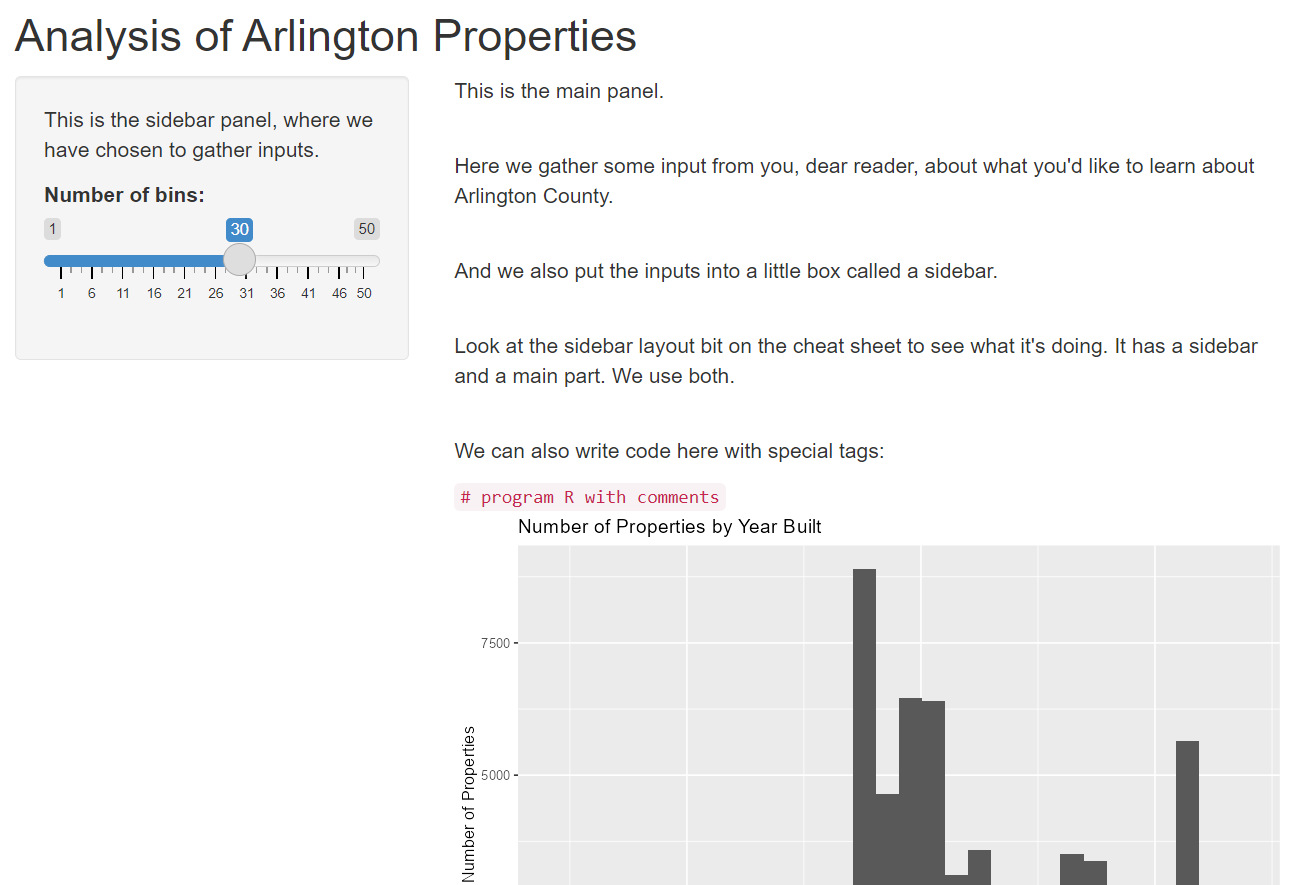
E.2. Add another data input part
Before we move to the server side, we will add one more element to the user input: another widget that allows users to input information.
Shiny has a variety of widgets that you can use to gather data from users – and these are (I think) the only way to gather data from users. You can see all the available widgets here.
We already have a slider. The goal of the new widget is for the user to tell us whether our next plot should be versus log of property assessed value, or just plain old assessed value (no log). For this kind of restricted choice, you could use radio buttons, a checkbox, or a list. We’re going to use the list version, which is the “select box” widget.
Click on the button that says “code” below this widget and a new window opens up, showing the server and ui code. You’ll need to click the ui tab and then you should see sample code, as below 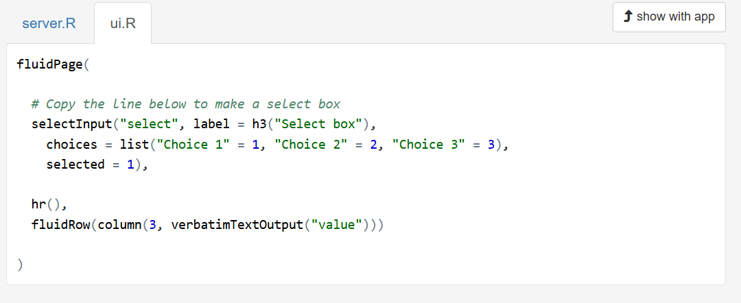
The first (unhelpfully unlabled) element inside the selectInput function should have a inputId = associated with it, to let know what that that is what the output of this selection is going to be called. The label element lets you give a heading for the box, and the choices list is where you specify the choices available to the user. The left side of each pair is the what the user sees. The right side of each pair is how you’d like to refer to this variable. Finally, the selected option sets the default selection when the app loads.
To add this widget to the app.R code, I create yet another new sub-directory called “add_widget” and save the code below in that sub-directory.
# this is the app.R in the add_widget directory

# 1. load packages
library(shiny)
library(tidyverse)

# 2. UI
# Define UI for app that draws a histogram ----
ui.stuff.that.shows <- fluidPage(

  # App title ----
  titlePanel("Analysis of Arlington Properties"),

  # you cant just put random text in this part. it needs to be inside some kind of directions
  sidebarLayout(

    sidebarPanel(

      p("This is the sidebar panel, where we have chosen to gather inputs."),

      # Input: Slider for the number of bins ----
      sliderInput(inputId = "bins",
                  label = "Number of bins:",
                  min = 1,
                  max = 50,
                  value = 30),

      # Input: Select boxes for levels or logs of property values
      selectInput(inputId = "level.or.log",
                  label = "Property Value in Levels or Logs?",
                  choices = list("Levels" = "TotalValueAmt",
                                 "Logs" = "ln.TotalValueAmt"),
                  selected = 1)

    ),
    mainPanel(

      p("Less text so maybe graphs will fit."),

      # Output: Histogram ----
      plotOutput(outputId = "distPlot"),

    )
  )
)

# 3. define server
#Define server logic required to draw a histogram ----
server.stuff.that.processes <- function(input, output) {

  # This expression that generates a histogram is wrapped in a call
  # to renderPlot to indicate that:
  #
  # 1. It is "reactive" and therefore should be automatically
  #    re-executed when inputs (input$bins) change
  # 2. Its output type is a plot
  output$distPlot <- renderPlot({

    dats <- readRDS("H:/pppa_data_viz/2025/tutorial_data/tutorial_10/small_arlington_2024_20250421.rds")

    ggplot() +
      geom_histogram(data = dats,
                     mapping = aes(x = PropertyYearBuilt),
                     bins = input$bins) +
      labs(title = "Number of Properties by Year Built",
           x = "Year Structure on Property was First Constructed",
           y = "Number of Properties")
  })

}

# 4. call Shiny to put app together
shinyApp(ui = ui.stuff.that.shows, server = server.stuff.that.processes)
The only difference between this file and the previous is the additional widget that we’ve added inside the sidebar. Nothing changes in the output when you change this element (test it!) since we haven’t linked the user input to a rendered output (that’s section F). We refer to this user-generated input as input$level.or.log, since that is what we named it in the InputId element – except that we don’t refer to it in this step as we are not doing anything with it.
To run this app, type
runApp("H:/pppa_data_viz/2025/tutorial_data/tutorial_10/add_widget")My app looks like 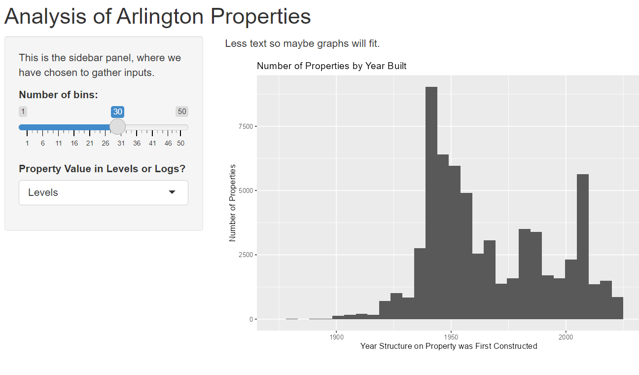
F. Adding to the output
Our last step for this tutorial is to take the new user input we just solicited and create an output – here a graph – from it. To do this, we’ll make one final new app.R file in yet another new sub-directory. I call mine “add_prop_vals.”
Our goal here is to add a second plot to our Shiny app, showing the relationship between the year a property’s structure was built and the assessed value of that property. We already have the user input from our modifications in E.2, and it’s called input$level.or.log. Now we need to add a scatter with this input on the y axis.
Part 1 (calling packages) and the UI part looks as below. The key addition is the additional plotOutput in the main panel (and the comma after the original output) to tell R that it should draw a second graph.
# this is app.R in add_prop_values

# 1. load packages
library(shiny)
library(tidyverse)

# 2. UI
# Define UI for app that draws a histogram ----
ui.stuff.that.shows <- fluidPage(

  # App title ----
  titlePanel("Analysis of Arlington Properties"),

  # you cant just put random text in this part. it needs to be inside some kind of directions
  sidebarLayout(

    sidebarPanel(

      p("This is the sidebar panel, where we have chosen to gather inputs."),

      # Input: Slider for the number of bins ----
      sliderInput(inputId = "bins",
                  label = "Number of bins:",
                  min = 1,
                  max = 50,
                  value = 30),

      # Input: Select boxes for levels or logs of property values
      selectInput(inputId = "level.or.log",
                  label = "Property Value in Levels or Logs?",
                  choices = list("Levels" = "TotalValueAmt",
                                 "Logs" = "ln.TotalValueAmt"),
                  selected = 1)

    ),
    mainPanel(

      p("Less text so maybe graphs will fit."),

      # Output: Histogram ----
      plotOutput(outputId = "distPlot"),


      # Output: Scatter ----
      plotOutput(outputId = "scatter.vals")

    )
  )
)
We define the second graph in the server portion of the code. The server portion (plus the finaly shinyApp() call) looks like this:
# 3. server logic
#Define server logic required to draw a histogram ----
server.stuff.that.processes <- function(input, output) {

  # This expression that generates a histogram is wrapped in a call
  # to renderPlot to indicate that:
  #
  # 1. It is "reactive" and therefore should be automatically
  #    re-executed when inputs (input$bins) change
  # 2. Its output type is a plot
  output$distPlot <- renderPlot({

    # need to save data in project directory for this to work!
    dats <- readRDS("H:/pppa_data_viz/2025/tutorial_data/tutorial_10/small_arlington_2024_20250421.rds")

    ggplot() +
      geom_histogram(data = dats,
                     mapping = aes(x = PropertyYearBuilt),
                     bins = input$bins) +
      labs(title = "Number of Properties by Year Built",
           x = "Year Structure on Property was First Constructed",
           y = "Number of Properties")
  })

  # This expression that generates a scatter is wrapped in a call
  # to renderPlot to indicate that:
  #
  # 1. It is "reactive" and therefore should be automatically
  #    re-executed when inputs (input$bins) change
  # 2. Its output type is a plot
  output$scatter.vals <- renderPlot({

    # need to save data in project directory for this to work!
    dats <- readRDS("H:/pppa_data_viz/2025/tutorial_data/tutorial_10/small_arlington_2024_20250421.rds")

    # this is text to fix up the labels below
    # there may be a more elegant way to do this, but I don't know it!
    desc.value <- ifelse(input$level.or.log == "ln.TotalValueAmt", "Log of ", "")

    ggplot() +
      geom_point(data = dats,
                 mapping = aes_string(x = "PropertyYearBuilt", y = input$level.or.log),
                 size = 0.2) +
      labs(title = paste0("Property Year Built vs ", desc.value, "Assessed Value"),
           x = "Year Structure on Property was First Constructed",
           y = paste0(desc.value,"Assessed Value"))
  })
}

# 4. assemble shiny app
shinyApp(ui = ui.stuff.that.shows, server = server.stuff.that.processes)
What this code adds is the second renderPlot() command. Inside of this command we load the data (this might be unnecessary). We then need to use the user-input variable in the scatter and modify the y label so that it is comprehensible.
We use the user-input value of input$level.or.log, but with one small twist. The aes() command expects to see a variable in the dataframe after x= or y= – not an input like input$level.or.log that resolves to a variable. Due to this, we turn to using aes_string(), rather than plain old aes(), which takes input variables as strings. Note that this means we have to change how we refer to the x variable as well, putting that in quotes.
And finally, we need to do something for the y axis label, which would just show the variable name if we didn’t make a fix. Generally, we need something that works for both variables – and the only difference between the two is that one of them is logged. So, above the ggplot command, we create a little stand alone variable caleld desc.value. We use an iselse function to set this variable to “Log of” if the user input is that we should use a log value; otherwise the value of this new variable is nothing (““). Note that we use this little variable in combination with paste0 in two places: in the title and in the y label.
Now try to run this new Shiny app. I run mine by typing
runApp("H:/pppa_data_viz/2025/tutorial_data/tutorial_10/add_prop_vals")Here’s what mine (and hopefully yours) looks like: 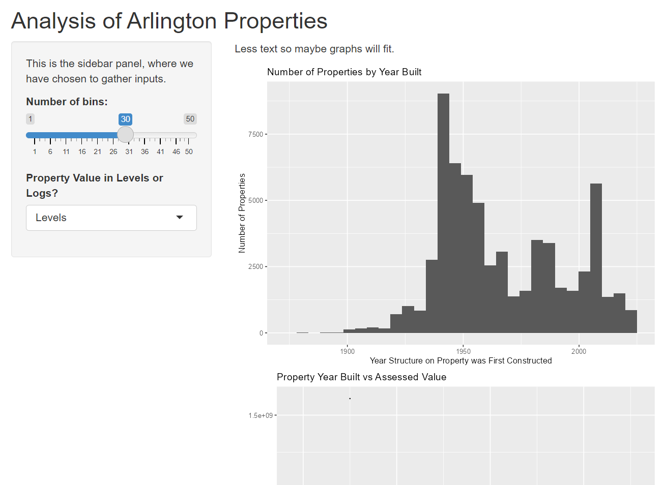
There are literally thousands of additional things you could do for this Shiny app, and to make this output prettier. But we have now covered the basics, and hopefully you’ve gotten a good overview of what Shiny can do. Now it’s your turn to try with a new dataset.
G. Posting Online
If you code an RShiny app, you can use the Posit company’s servers and web hosting to make a online version of your app. In short, for any RShiny output you make, Posit will give you a link you can share or post in a webpage. Be aware that this means that the Posit servers will upload your data. So do not use any data that you are not willing to give up forever.
This process of putting your data and graphing up is called “deploying” your work.
Importantly, any data or figures you want the Shiny app to call or input need to be inside the project directory. This means that my file app.r in H:/pppa_data_viz/2025/tutorial_data/tutorial_10/add_prop_vals gave an error when I follow the steps below. Specifically, R told me Paths should be to files within the project directory.
To fix this problem, I created a new directory for deployment. I call the new directory H:/pppa_data_viz/2025/tutorial_data/tutorial_10/add_prop_vals_deploy and I put my app.R file and a copy of the Arlington dataset in this same directory.
Here’s what the final product looks like, either online or static picture below: 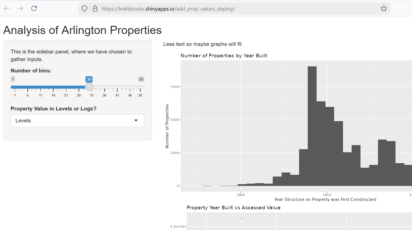
Now you give it a try. Make a new directory, save the app.R file from the previous step there, along with the data. When you’ve done this, you’re ready to do the steps to deploy.
First, go to this page to create an account (or login with google). After making an account, you’ll get to a page with further instructions. In short, you must
- install the
rsconnectpackage - authorize your account
- here you choose the phrase that will go in your webpage
- deploy the app by typing
rsconnect::deployApp('path/to/your/app')- make sure you copy the entire instruction on this page, along with the secret code
After my app is complete, R reports
── Deployment complete ──────────────────────────────────────────────────────────────────────────
✔ Successfully deployed to <https://leahbrooks.shinyapps.io/add_prop_values_deploy/>
>
The last line is the link at which you’ll find your app.
H. Homework
Make a Shiny app with two inputs and two graphs using a different dataset.
All you need to submit for this tutorial is the hyperlink to the RShiny interactive you made. Send this link in your Piazza email with a tutorial 10 label. I’ll gather these links on a webpage so everyone can see what classmates have done. To be clear – all you need to submit is your final Shiny weblink.